
本文經機器之心(微信公眾號:almosthuman2014)授權轉載,禁止二次轉載
選自towardsdatascience
作者:Dipanjan Sarkar
參與:Jane W、乾樹、黃小天
資料聚合、彙總和視覺化是支撐資料分析領域的三大支柱。長久以來,資料視覺化都是一個強有力的工具,被業界廣泛使用,卻受限於 2 維。在本文中,作者將探索一些有效的多維資料視覺化策略(範圍從 1 維到 6 維)。
01 介紹
描述性分析(descriptive analytics)是任何分析生命週期的資料科學專案或特定研究的核心組成部分之一。資料聚合(aggregation)、彙總(summarization)和視覺化(visualization)是支撐資料分析領域的主要支柱。從傳統商業智慧(Business Intelligence)開始,甚至到如今人工智慧時代,資料視覺化都是一個強有力的工具;由於其能有效抽取正確的資訊,同時清楚容易地理解和解釋結果,視覺化被業界組織廣泛使用。然而,處理多維資料集(通常具有 2 個以上屬性)開始引起問題,因為我們的資料分析和通訊的媒介通常限於 2 個維度。在本文中,我們將探索一些有效的多維資料視覺化策略(範圍從 1 維到 6 維)。
02 動機
「一圖勝千言」
這是一句我們熟悉的非常流行的英語習語,可以充當將資料視覺化作為分析的有效工具的靈感和動力。永遠記住:「有效的資料視覺化既是一門藝術,也是一門科學。」在開始之前,我還要提及下麵一句非常相關的引言,它強調了資料視覺化的必要性。
「一張圖片的最大價值在於,它迫使我們註意到我們從未期望看到的東西。」
——John Tukey
03 快速回顧視覺化
本文假設一般讀者知道用於繪圖和視覺化資料的基本圖表型別,因此這裡不再贅述,但在本文隨後的實踐中,我們將會涉及大部分圖表型別。著名的視覺化先驅和統計學家 Edward Tufte 說過,資料視覺化應該在資料的基礎上,以清晰、精確和高效的方式傳達資料樣式和洞察資訊。
結構化資料通常包括由行和特徵表徵的資料觀測值或由串列徵的資料屬性。每列也可以被稱為資料集的某特定維度。最常見的資料型別包括連續型數值資料和離散型分類資料。因此,任何資料視覺化將基本上以散點圖、直方圖、箱線圖等簡單易懂的形式描述一個或多個資料屬性。本文將涵蓋單變數(1 維)和多變數(多維)資料視覺化策略。這裡將使用 Python 機器學習生態系統,我們建議先檢查用於資料分析和視覺化的框架,包括 pandas、matplotlib、seaborn、plotly 和 bokeh。除此之外,如果你有興趣用資料製作精美而有意義的視覺化檔案,那麼瞭解 D3.js(https://d3js.org/)也是必須的。有興趣的讀者可以閱讀 Edward Tufte 的「The Visual Display of Quantitative Information」。
閑話至此,讓我們來看看視覺化(和程式碼)吧!
別在這兒談論理論和概念了,讓我們開始進入正題吧。我們將使用 UCI 機器學習庫(https://archive.ics.uci.edu/ml/index.php)中的 Wine Quality Data Set。這些資料實際上是由兩個資料集組成的,這兩個資料集描述了葡萄牙「Vinho Verde」葡萄酒中紅色和白色酒的各種成分。本文中的所有分析都在我的 GitHub 儲存庫中,你可以用 Jupyter Notebook 中的程式碼來嘗試一下!
我們將首先載入以下必要的依賴包進行分析。
import pandas as pd
import matplotlib.pyplot as plt
from mpl_toolkits.mplot3d import Axes3D
import matplotlib as mpl
import numpy as np
import seaborn as sns
%matplotlib inline
我們將主要使用 matplotlib 和 seaborn 作為我們的視覺化框架,但你可以自由選擇並嘗試任何其它框架。首先進行基本的資料預處理步驟。
white_wine = pd.read_csv(‘winequality-white.csv’, sep=’;’)
red_wine = pd.read_csv(‘winequality-red.csv’, sep=’;’)
# store wine type as an attribute
red_wine[‘wine_type’] = ‘red’
white_wine[‘wine_type’] = ‘white’
# bucket wine quality scores into qualitative quality labels
red_wine[‘quality_label’] = red_wine[‘quality’].apply(lambda value: ‘low’
if value <= 5 else 'medium'
if value <= 7 else 'high')
red_wine[‘quality_label’] = pd.Categorical(red_wine[‘quality_label’],
categories=[‘low’, ‘medium’, ‘high’])
white_wine[‘quality_label’] = white_wine[‘quality’].apply(lambda value: ‘low’
if value <= 5 else 'medium'
if value <= 7 else 'high')
white_wine[‘quality_label’] = pd.Categorical(white_wine[‘quality_label’],
categories=[‘low’, ‘medium’, ‘high’])
# merge red and white wine datasets
wines = pd.concat([red_wine, white_wine])
# re-shuffle records just to randomize data points
wines = wines.sample(frac=1, random_state=42).reset_index(drop=True)
我們透過合併有關紅、白葡萄酒樣本的資料集來建立單個葡萄酒資料框架。我們還根據葡萄酒樣品的質量屬性建立一個新的分類變數 quality_label。現在我們來看看資料前幾行。
wines.head()
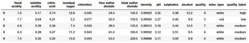
葡萄酒質量資料集
很明顯,我們有幾個葡萄酒樣本的數值和分類屬性。每個觀測樣本屬於紅葡萄酒或白葡萄酒樣品,屬性是從物理化學測試中測量和獲得的特定屬性或性質。如果你想瞭解每個屬性(屬性對應的變數名稱一目瞭然)詳細的解釋,你可以檢視 Jupyter Notebook。讓我們快速對這些感興趣的屬性進行基本的描述性概括統計。
subset_attributes = [‘residual sugar’, ‘total sulfur dioxide’, ‘sulphates’,
‘alcohol’, ‘volatile acidity’, ‘quality’]
rs = round(red_wine[subset_attributes].describe(),2)
ws = round(white_wine[subset_attributes].describe(),2)
pd.concat([rs, ws], axis=1, keys=[‘Red Wine Statistics’, ‘White Wine Statistics’])

葡萄酒型別的基本描述性統計
比較這些不同型別的葡萄酒樣本的統計方法相當容易。註意一些屬性的明顯差異。稍後我們將在一些視覺化中強調這些內容。
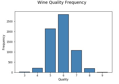
04 單變數分析
單變數分析基本上是資料分析或視覺化的最簡單形式,因為只關心分析一個資料屬性或變數並將其視覺化(1 維)。
視覺化 1 維資料(1-D)
使所有數值資料及其分佈視覺化的最快、最有效的方法之一是利用 pandas 畫直方圖(histogram)。
wines.hist(bins=15, color=’steelblue’, edgecolor=’black’, linewidth=1.0,
xlabelsize=8, ylabelsize=8, grid=False)
plt.tight_layout(rect=(0, 0, 1.2, 1.2))

將屬性作為 1 維資料視覺化
上圖給出了視覺化任何屬性的基本資料分佈的一個好主意。
讓我們進一步視覺化其中一個連續型數值屬性。直方圖或核密度圖能夠很好地幫助理解該屬性資料的分佈。
# Histogram
fig = plt.figure(figsize = (6,4))
title = fig.suptitle(“Sulphates Content in Wine”, fontsize=14)
fig.subplots_adjust(top=0.85, wspace=0.3)
ax = fig.add_subplot(1,1, 1)
ax.set_xlabel(“Sulphates”)
ax.set_ylabel(“Frequency”)
ax.text(1.2, 800, r’$\mu$=’+str(round(wines[‘sulphates’].mean(),2)),
fontsize=12)
freq, bins, patches = ax.hist(wines[‘sulphates’], color=’steelblue’, bins=15,
edgecolor=’black’, linewidth=1)
# Density Plot
fig = plt.figure(figsize = (6, 4))
title = fig.suptitle(“Sulphates Content in Wine”, fontsize=14)
fig.subplots_adjust(top=0.85, wspace=0.3)
ax1 = fig.add_subplot(1,1, 1)
ax1.set_xlabel(“Sulphates”)
ax1.set_ylabel(“Frequency”)
sns.kdeplot(wines[‘sulphates’], ax=ax1, shade=True, color=’steelblue’)

視覺化 1 維連續型數值資料
從上面的圖表中可以看出,葡萄酒中硫酸鹽的分佈存在明顯的右偏(right skew)。
視覺化一個離散分型別資料屬性稍有不同,條形圖是(bar plot)最有效的方法之一。你也可以使用餅圖(pie-chart),但一般來說要儘量避免,尤其是當不同類別的數量超過 3 個時。
# Histogram
fig = plt.figure(figsize = (6,4))
title = fig.suptitle(“Sulphates Content in Wine”, fontsize=14)
fig.subplots_adjust(top=0.85, wspace=0.3)
ax = fig.add_subplot(1,1, 1)
ax.set_xlabel(“Sulphates”)
ax.set_ylabel(“Frequency”)
ax.text(1.2, 800, r’$\mu$=’+str(round(wines[‘sulphates’].mean(),2)),
fontsize=12)
freq, bins, patches = ax.hist(wines[‘sulphates’], color=’steelblue’, bins=15,
edgecolor=’black’, linewidth=1)
# Density Plot
fig = plt.figure(figsize = (6, 4))
title = fig.suptitle(“Sulphates Content in Wine”, fontsize=14)
fig.subplots_adjust(top=0.85, wspace=0.3)
ax1 = fig.add_subplot(1,1, 1)
ax1.set_xlabel(“Sulphates”)
ax1.set_ylabel(“Frequency”)
sns.kdeplot(wines[‘sulphates’], ax=ax1, shade=True, color=’steelblue’)
視覺化 1 維離散分型別資料
現在我們繼續分析更高維的資料。
05 多變數分析
多元分析才是真正有意思並且有複雜性的領域。這裡我們分析多個資料維度或屬性(2 個或更多)。多變數分析不僅包括檢查分佈,還包括這些屬性之間的潛在關係、樣式和相關性。你也可以根據需要解決的問題,利用推斷統計(inferential statistics)和假設檢驗,檢查不同屬性、群體等的統計顯著性(significance)。
視覺化 2 維資料(2-D)
檢查不同資料屬性之間的潛在關係或相關性的最佳方法之一是利用配對相關性矩陣(pair-wise correlation matrix)並將其視覺化為熱力圖。
# Correlation Matrix Heatmap
f, ax = plt.subplots(figsize=(10, 6))
corr = wines.corr()
hm = sns.heatmap(round(corr,2), annot=True, ax=ax, cmap=”coolwarm”,fmt=’.2f’,
linewidths=.05)
f.subplots_adjust(top=0.93)
t= f.suptitle(‘Wine Attributes Correlation Heatmap’, fontsize=14)
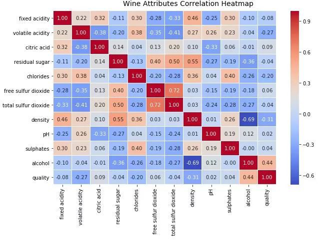
用相關性熱力圖視覺化 2 維資料
熱力圖中的梯度根據相關性的強度而變化,你可以很容易發現彼此之間具有強相關性的潛在屬性。另一種視覺化的方法是在感興趣的屬性之間使用配對散點圖。
# Correlation Matrix Heatmap
f, ax = plt.subplots(figsize=(10, 6))
corr = wines.corr()
hm = sns.heatmap(round(corr,2), annot=True, ax=ax, cmap=”coolwarm”,fmt=’.2f’,
linewidths=.05)
f.subplots_adjust(top=0.93)
t= f.suptitle(‘Wine Attributes Correlation Heatmap’, fontsize=14)

用配對散點圖視覺化 2 維資料
根據上圖,可以看到散點圖也是觀察資料屬性的 2 維潛在關係或樣式的有效方式。另一種將多元資料視覺化為多個屬性的方法是使用平行坐標圖。
# Correlation Matrix Heatmap
f, ax = plt.subplots(figsize=(10, 6))
corr = wines.corr()
hm = sns.heatmap(round(corr,2), annot=True, ax=ax, cmap=”coolwarm”,fmt=’.2f’,
linewidths=.05)
f.subplots_adjust(top=0.93)
t= f.suptitle(‘Wine Attributes Correlation Heatmap’, fontsize=14)

用平行坐標圖視覺化多維資料
基本上,在如上所述的視覺化中,點被表徵為連線的線段。每條垂直線代表一個資料屬性。所有屬性中的一組完整的連線線段表徵一個資料點。因此,趨於同一類的點將會更加接近。僅僅透過觀察就可以清楚看到,與白葡萄酒相比,紅葡萄酒的密度略高。與紅葡萄酒相比,白葡萄酒的殘糖和二氧化硫總量也較高,紅葡萄酒的固定酸度高於白葡萄酒。查一下我們之前得到的統計表中的統計資料,看看能否驗證這個假設!
因此,讓我們看看視覺化兩個連續型數值屬性的方法。散點圖和聯合分佈圖(joint plot)是檢查樣式、關係以及屬性分佈的特別好的方法。
# Scatter Plot
plt.scatter(wines[‘sulphates’], wines[‘alcohol’],
alpha=0.4, edgecolors=’w’)
plt.xlabel(‘Sulphates’)
plt.ylabel(‘Alcohol’)
plt.title(‘Wine Sulphates – Alcohol Content’,y=1.05)
# Joint Plot
jp = sns.jointplot(x=’sulphates’, y=’alcohol’, data=wines,
kind=’reg’, space=0, size=5, ratio=4)
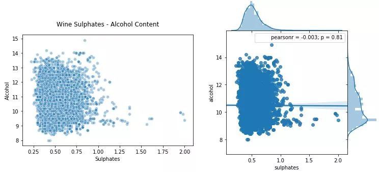
使用散點圖和聯合分佈圖視覺化 2 維連續型數值資料
散點圖在上圖左側,聯合分佈圖在右側。就像我們提到的那樣,你可以檢視聯合分佈圖中的相關性、關係以及分佈。
如何視覺化兩個連續型數值屬性?一種方法是為分類維度畫單獨的圖(子圖)或分面(facet)。
# Using subplots or facets along with Bar Plots
fig = plt.figure(figsize = (10, 4))
title = fig.suptitle(“Wine Type – Quality”, fontsize=14)
fig.subplots_adjust(top=0.85, wspace=0.3)
# red wine – wine quality
ax1 = fig.add_subplot(1,2, 1)
ax1.set_title(“Red Wine”)
ax1.set_xlabel(“Quality”)
ax1.set_ylabel(“Frequency”)
rw_q = red_wine[‘quality’].value_counts()
rw_q = (list(rw_q.index), list(rw_q.values))
ax1.set_ylim([0, 2500])
ax1.tick_params(axis=’both’, which=’major’, labelsize=8.5)
bar1 = ax1.bar(rw_q[0], rw_q[1], color=’red’,
edgecolor=’black’, linewidth=1)
# white wine – wine quality
ax2 = fig.add_subplot(1,2, 2)
ax2.set_title(“White Wine”)
ax2.set_xlabel(“Quality”)
ax2.set_ylabel(“Frequency”)
ww_q = white_wine[‘quality’].value_counts()
ww_q = (list(ww_q.index), list(ww_q.values))
ax2.set_ylim([0, 2500])
ax2.tick_params(axis=’both’, which=’major’, labelsize=8.5)
bar2 = ax2.bar(ww_q[0], ww_q[1], color=’white’,
edgecolor=’black’, linewidth=1)
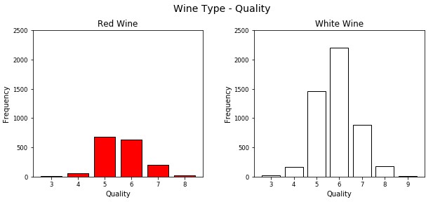
使用條形圖和子圖視覺化 2 維離散型分類資料
雖然這是一種視覺化分類資料的好方法,但正如所見,利用 matplotlib 需要編寫大量的程式碼。另一個好方法是在單個圖中為不同的屬性畫堆積條形圖或多個條形圖。可以很容易地利用 seaborn 做到。
# Multi-bar Plot
cp = sns.countplot(x=”quality”, hue=”wine_type”, data=wines,
palette={“red”: “#FF9999”, “white”: “#FFE888”})
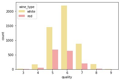
在一個條形圖中視覺化 2 維離散型分類資料
這看起來更清晰,你也可以有效地從單個圖中比較不同的類別。
讓我們看看視覺化 2 維混合屬性(大多數兼有數值和分類)。一種方法是使用分圖\子圖與直方圖或核密度圖。
# facets with histograms
fig = plt.figure(figsize = (10,4))
title = fig.suptitle(“Sulphates Content in Wine”, fontsize=14)
fig.subplots_adjust(top=0.85, wspace=0.3)
ax1 = fig.add_subplot(1,2, 1)
ax1.set_title(“Red Wine”)
ax1.set_xlabel(“Sulphates”)
ax1.set_ylabel(“Frequency”)
ax1.set_ylim([0, 1200])
ax1.text(1.2, 800, r’$\mu$=’+str(round(red_wine[‘sulphates’].mean(),2)),
fontsize=12)
r_freq, r_bins, r_patches = ax1.hist(red_wine[‘sulphates’], color=’red’, bins=15,
edgecolor=’black’, linewidth=1)
ax2 = fig.add_subplot(1,2, 2)
ax2.set_title(“White Wine”)
ax2.set_xlabel(“Sulphates”)
ax2.set_ylabel(“Frequency”)
ax2.set_ylim([0, 1200])
ax2.text(0.8, 800, r’$\mu$=’+str(round(white_wine[‘sulphates’].mean(),2)),
fontsize=12)
w_freq, w_bins, w_patches = ax2.hist(white_wine[‘sulphates’], color=’white’, bins=15,
edgecolor=’black’, linewidth=1)
# facets with density plots
fig = plt.figure(figsize = (10, 4))
title = fig.suptitle(“Sulphates Content in Wine”, fontsize=14)
fig.subplots_adjust(top=0.85, wspace=0.3)
ax1 = fig.add_subplot(1,2, 1)
ax1.set_title(“Red Wine”)
ax1.set_xlabel(“Sulphates”)
ax1.set_ylabel(“Density”)
sns.kdeplot(red_wine[‘sulphates’], ax=ax1, shade=True, color=’r’)
ax2 = fig.add_subplot(1,2, 2)
ax2.set_title(“White Wine”)
ax2.set_xlabel(“Sulphates”)
ax2.set_ylabel(“Density”)
sns.kdeplot(white_wine[‘sulphates’], ax=ax2, shade=True, color=’y’)

利用分面和直方圖\核密度圖視覺化 2 維混合屬性
雖然這很好,但是我們再一次編寫了大量程式碼,我們可以透過利用 seaborn 避免這些,在單個圖表中畫出這些圖。
# Using multiple Histograms
fig = plt.figure(figsize = (6, 4))
title = fig.suptitle(“Sulphates Content in Wine”, fontsize=14)
fig.subplots_adjust(top=0.85, wspace=0.3)
ax = fig.add_subplot(1,1, 1)
ax.set_xlabel(“Sulphates”)
ax.set_ylabel(“Frequency”)
g = sns.FacetGrid(wines, hue=’wine_type’, palette={“red”: “r”, “white”: “y”})
g.map(sns.distplot, ‘sulphates’, kde=False, bins=15, ax=ax)
ax.legend(title=’Wine Type’)
plt.close(2)

利用多維直方圖視覺化 2 維混合屬性
可以看到上面生成的圖形清晰簡潔,我們可以輕鬆地比較各種分佈。除此之外,箱線圖(box plot)是根據分類屬性中的不同數值有效描述數值資料組的另一種方法。箱線圖是瞭解資料中四分位數值以及潛在異常值的好方法。
# Box Plots
f, (ax) = plt.subplots(1, 1, figsize=(12, 4))
f.suptitle(‘Wine Quality – Alcohol Content’, fontsize=14)
sns.boxplot(x=”quality”, y=”alcohol”, data=wines, ax=ax)
ax.set_xlabel(“Wine Quality”,size = 12,alpha=0.8)
ax.set_ylabel(“Wine Alcohol %”,size = 12,alpha=0.8)
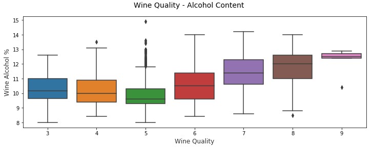
2 維混合屬性的有效視覺化方法——箱線圖
另一個類似的視覺化是小提琴圖,這是使用核密度圖顯示分組數值資料的另一種有效方法(描繪了資料在不同值下的機率密度)。
# Violin Plots
f, (ax) = plt.subplots(1, 1, figsize=(12, 4))
f.suptitle(‘Wine Quality – Sulphates Content’, fontsize=14)
sns.violinplot(x=”quality”, y=”sulphates”, data=wines, ax=ax)
ax.set_xlabel(“Wine Quality”,size = 12,alpha=0.8)
ax.set_ylabel(“Wine Sulphates”,size = 12,alpha=0.8)

2 維混合屬性的有效視覺化方法——小提琴圖
你可以清楚看到上面的不同酒品質類別的葡萄酒硫酸鹽的密度圖。
將 2 維資料視覺化非常簡單直接,但是隨著維數(屬性)數量的增加,資料開始變得複雜。原因是因為我們受到顯示媒介和環境的雙重約束。
對於 3 維資料,可以透過在圖表中採用 z 軸或利用子圖和分面來引入深度的虛擬坐標。
但是,對於 3 維以上的資料來說,更難以直觀地表徵。高於 3 維的最好方法是使用圖分面、顏色、形狀、大小、深度等等。你還可以使用時間作為維度,為隨時間變化的屬性製作一段動畫(這裡時間是資料中的維度)。看看 Hans Roslin 的精彩演講就會獲得相同的想法!
視覺化 3 維資料(3-D)
這裡研究有 3 個屬性或維度的資料,我們可以透過考慮配對散點圖並引入顏色或色調將分類維度中的值分離出來。
# Scatter Plot with Hue for visualizing data in 3-D
cols = [‘density’, ‘residual sugar’, ‘total sulfur dioxide’, ‘fixed acidity’, ‘wine_type’]
pp = sns.pairplot(wines[cols], hue=’wine_type’, size=1.8, aspect=1.8,
palette={“red”: “#FF9999”, “white”: “#FFE888”},
plot_kws=dict(edgecolor=”black”, linewidth=0.5))
fig = pp.fig
fig.subplots_adjust(top=0.93, wspace=0.3)
t = fig.suptitle(‘Wine Attributes Pairwise Plots’, fontsize=14)
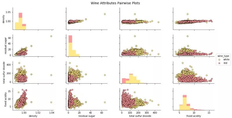
用散點圖和色調(顏色)視覺化 3 維資料
上圖可以檢視相關性和樣式,也可以比較葡萄酒組。就像我們可以清楚地看到白葡萄酒的總二氧化硫和殘糖比紅葡萄酒高。
讓我們來看看視覺化 3 個連續型數值屬性的策略。一種方法是將 2 個維度表徵為常規長度(x 軸)和寬度(y 軸)並且將第 3 維表徵為深度(z 軸)的概念。
# Visualizing 3-D numeric data with Scatter Plots
# length, breadth and depth
fig = plt.figure(figsize=(8, 6))
ax = fig.add_subplot(111, projection=’3d’)
xs = wines[‘residual sugar’]
ys = wines[‘fixed acidity’]
zs = wines[‘alcohol’]
ax.scatter(xs, ys, zs, s=50, alpha=0.6, edgecolors=’w’)
ax.set_xlabel(‘Residual Sugar’)
ax.set_ylabel(‘Fixed Acidity’)
ax.set_zlabel(‘Alcohol’)

透過引入深度的概念來視覺化 3 維數值資料
我們還可以利用常規的 2 維坐標軸,並將尺寸大小的概念作為第 3 維(本質上是氣泡圖),其中點的尺寸大小表徵第 3 維的數量。
# Visualizing 3-D numeric data with a bubble chart
# length, breadth and size
plt.scatter(wines[‘fixed acidity’], wines[‘alcohol’], s=wines[‘residual sugar’]*25,
alpha=0.4, edgecolors=’w’)
plt.xlabel(‘Fixed Acidity’)
plt.ylabel(‘Alcohol’)
plt.title(‘Wine Alcohol Content – Fixed Acidity – Residual Sugar’,y=1.05)

透過引入尺寸大小的概念來視覺化 3 維數值資料
因此,你可以看到上面的圖表不是一個傳統的散點圖,而是點(氣泡)大小基於不同殘糖量的的氣泡圖。當然,並不總像這種情況可以發現資料明確的樣式,我們看到其它兩個維度的大小也不同。
為了視覺化 3 個離散型分類屬性,我們可以使用常規的條形圖,可以利用色調的概念以及分面或子圖表徵額外的第 3 個維度。seaborn 框架幫助我們最大程度地減少程式碼,並高效地繪圖。
# Visualizing 3-D categorical data using bar plots
# leveraging the concepts of hue and facets
fc = sns.factorplot(x=”quality”, hue=”wine_type”, col=”quality_label”,
data=wines, kind=”count”,
palette={“red”: “#FF9999”, “white”: “#FFE888”})
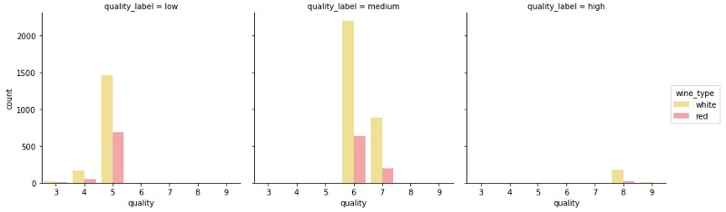
透過引入色調和分面的概念視覺化 3 維分類資料
上面的圖表清楚地顯示了與每個維度相關的頻率,可以看到,透過圖表能夠容易有效地理解相關內容。
考慮到視覺化 3 維混合屬性,我們可以使用色調的概念來將其中一個分類屬性視覺化,同時使用傳統的如散點圖來視覺化數值屬性的 2 個維度。
# Visualizing 3-D mix data using scatter plots
# leveraging the concepts of hue for categorical dimension
jp = sns.pairplot(wines, x_vars=[“sulphates”], y_vars=[“alcohol”], size=4.5,
hue=”wine_type”, palette={“red”: “#FF9999”, “white”: “#FFE888”},
plot_kws=dict(edgecolor=”k”, linewidth=0.5))
# we can also view relationships\correlations as needed
lp = sns.lmplot(x=’sulphates’, y=’alcohol’, hue=’wine_type’,
palette={“red”: “#FF9999”, “white”: “#FFE888”},
data=wines, fit_reg=True, legend=True,
scatter_kws=dict(edgecolor=”k”, linewidth=0.5))

透過利用散點圖和色調的概念視覺化 3 維混合屬性
因此,色調作為類別或群體的良好區分,雖然如上圖觀察沒有相關性或相關性非常弱,但從這些圖中我們仍可以理解,與白葡萄酒相比,紅葡萄酒的硫酸鹽含量較高。你也可以使用核密度圖代替散點圖來理解 3 維資料。
# Visualizing 3-D mix data using kernel density plots
# leveraging the concepts of hue for categorical dimension
ax = sns.kdeplot(white_wine[‘sulphates’], white_wine[‘alcohol’],
cmap=”YlOrBr”, shade=True, shade_lowest=False)
ax = sns.kdeplot(red_wine[‘sulphates’], red_wine[‘alcohol’],
cmap=”Reds”, shade=True, shade_lowest=False)
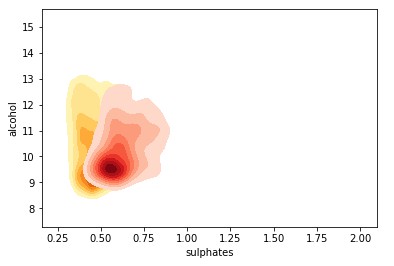
透過利用核密度圖和色調的概念視覺化 3 維混合屬性
與預期一致且相當明顯,紅葡萄酒樣品比白葡萄酒具有更高的硫酸鹽含量。你還可以根據色調強度檢視密度濃度。
如果我們正在處理有多個分類屬性的 3 維資料,我們可以利用色調和其中一個常規軸進行視覺化,並使用如箱線圖或小提琴圖來視覺化不同的資料組。
# Visualizing 3-D mix data using violin plots
# leveraging the concepts of hue and axes for > 1 categorical dimensions
f, (ax1, ax2) = plt.subplots(1, 2, figsize=(14, 4))
f.suptitle(‘Wine Type – Quality – Acidity’, fontsize=14)
sns.violinplot(x=”quality”, y=”volatile acidity”,
data=wines, inner=”quart”, linewidth=1.3,ax=ax1)
ax1.set_xlabel(“Wine Quality”,size = 12,alpha=0.8)
ax1.set_ylabel(“Wine Volatile Acidity”,size = 12,alpha=0.8)
sns.violinplot(x=”quality”, y=”volatile acidity”, hue=”wine_type”,
data=wines, split=True, inner=”quart”, linewidth=1.3,
palette={“red”: “#FF9999”, “white”: “white”}, ax=ax2)
ax2.set_xlabel(“Wine Quality”,size = 12,alpha=0.8)
ax2.set_ylabel(“Wine Volatile Acidity”,size = 12,alpha=0.8)
l = plt.legend(loc=’upper right’, title=’Wine Type’)
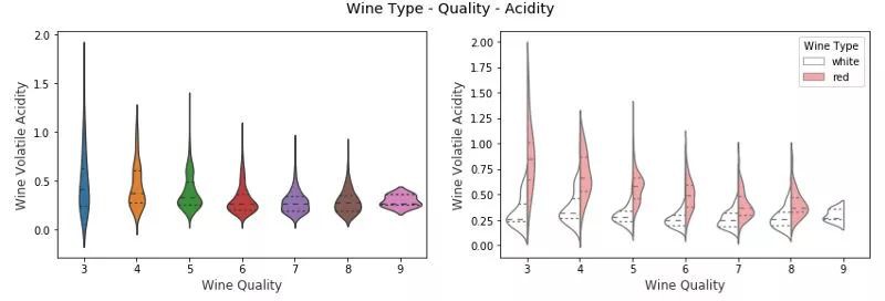
透過利用分圖小提琴圖和色調的概念來視覺化 3 維混合屬性
在上圖中,我們可以看到,在右邊的 3 維視覺化圖中,我們用 x 軸表示葡萄酒質量,wine_type 用色調表徵。我們可以清楚地看到一些有趣的見解,例如與白葡萄酒相比紅葡萄酒的揮發性酸度更高。
你也可以考慮使用箱線圖來代表具有多個分類變數的混合屬性。
# Visualizing 3-D mix data using box plots
# leveraging the concepts of hue and axes for > 1 categorical dimensions
f, (ax1, ax2) = plt.subplots(1, 2, figsize=(14, 4))
f.suptitle(‘Wine Type – Quality – Alcohol Content’, fontsize=14)
sns.boxplot(x=”quality”, y=”alcohol”, hue=”wine_type”,
data=wines, palette={“red”: “#FF9999”, “white”: “white”}, ax=ax1)
ax1.set_xlabel(“Wine Quality”,size = 12,alpha=0.8)
ax1.set_ylabel(“Wine Alcohol %”,size = 12,alpha=0.8)
sns.boxplot(x=”quality_label”, y=”alcohol”, hue=”wine_type”,
data=wines, palette={“red”: “#FF9999”, “white”: “white”}, ax=ax2)
ax2.set_xlabel(“Wine Quality Class”,size = 12,alpha=0.8)
ax2.set_ylabel(“Wine Alcohol %”,size = 12,alpha=0.8)
l = plt.legend(loc=’best’, title=’Wine Type’)

透過利用箱線圖和色調的概念視覺化 3 維混合屬性
我們可以看到,對於質量和 quality_label 屬性,葡萄酒酒精含量都會隨著質量的提高而增加。另外紅葡萄酒與相同品質類別的白葡萄酒相比具有更高的酒精含量(中位數)。然而,如果檢查質量等級,我們可以看到,對於較低等級的葡萄酒(3 和 4),白葡萄酒酒精含量(中位數)大於紅葡萄酒樣品。否則,紅葡萄酒與白葡萄酒相比似乎酒精含量(中位數)略高。
視覺化 4 維資料(4-D)
基於上述討論,我們利用圖表的各個元件視覺化多個維度。一種視覺化 4 維資料的方法是在傳統圖如散點圖中利用深度和色調表徵特定的資料維度。
# Visualizing 4-D mix data using scatter plots
# leveraging the concepts of hue and depth
fig = plt.figure(figsize=(8, 6))
t = fig.suptitle(‘Wine Residual Sugar – Alcohol Content – Acidity – Type’, fontsize=14)
ax = fig.add_subplot(111, projection=’3d’)
xs = list(wines[‘residual sugar’])
ys = list(wines[‘alcohol’])
zs = list(wines[‘fixed acidity’])
data_points = [(x, y, z) for x, y, z in zip(xs, ys, zs)]
colors = [‘red’ if wt == ‘red’ else ‘yellow’ for wt in list(wines[‘wine_type’])]
for data, color in zip(data_points, colors):
x, y, z = data
ax.scatter(x, y, z, alpha=0.4, c=color, edgecolors=’none’, s=30)
ax.set_xlabel(‘Residual Sugar’)
ax.set_ylabel(‘Alcohol’)
ax.set_zlabel(‘Fixed Acidity’)

透過利用散點圖以及色調和深度的概念視覺化 4 維資料
wine_type 屬性由上圖中的色調表徵得相當明顯。此外,由於圖的複雜性,解釋這些視覺化開始變得困難,但我們仍然可以看出,例如紅葡萄酒的固定酸度更高,白葡萄酒的殘糖更高。當然,如果酒精和固定酸度之間有某種聯絡,我們可能會看到一個逐漸增加或減少的資料點趨勢。
另一個策略是使用二維圖,但利用色調和資料點大小作為資料維度。通常情況下,這將類似於氣泡圖等我們先前視覺化的圖表。
# Visualizing 4-D mix data using bubble plots
# leveraging the concepts of hue and size
size = wines[‘residual sugar’]*25
fill_colors = [‘#FF9999′ if wt==’red’ else ‘#FFE888’ for wt in list(wines[‘wine_type’])]
edge_colors = [‘red’ if wt==’red’ else ‘orange’ for wt in list(wines[‘wine_type’])]
plt.scatter(wines[‘fixed acidity’], wines[‘alcohol’], s=size,
alpha=0.4, color=fill_colors, edgecolors=edge_colors)
plt.xlabel(‘Fixed Acidity’)
plt.ylabel(‘Alcohol’)
plt.title(‘Wine Alcohol Content – Fixed Acidity – Residual Sugar – Type’,y=1.05)

透過利用氣泡圖以及色調和大小的概念視覺化 4 維資料
我們用色調代表 wine_type 和資料點大小代表殘糖。我們確實看到了與前面圖表中觀察到的相似樣式,白葡萄酒氣泡尺寸更大表徵了白葡萄酒的殘糖值更高。
如果我們有多於兩個分類屬性表徵,可在常規的散點圖描述數值資料的基礎上利用色調和分面來描述這些屬性。我們來看幾個實體。
# Visualizing 4-D mix data using scatter plots
# leveraging the concepts of hue and facets for > 1 categorical attributes
g = sns.FacetGrid(wines, col=”wine_type”, hue=’quality_label’,
col_order=[‘red’, ‘white’], hue_order=[‘low’, ‘medium’, ‘high’],
aspect=1.2, size=3.5, palette=sns.light_palette(‘navy’, 4)[1:])
g.map(plt.scatter, “volatile acidity”, “alcohol”, alpha=0.9,
edgecolor=’white’, linewidth=0.5, s=100)
fig = g.fig
fig.subplots_adjust(top=0.8, wspace=0.3)
fig.suptitle(‘Wine Type – Alcohol – Quality – Acidity’, fontsize=14)
l = g.add_legend(title=’Wine Quality Class’)
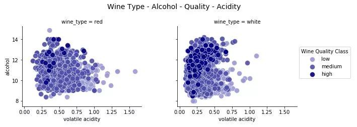
透過利用散點圖以及色調和分面的概念視覺化 4 維資料
這種視覺化的有效性使得我們可以輕鬆識別多種樣式。白葡萄酒的揮發酸度較低,同時高品質葡萄酒具有較低的酸度。也基於白葡萄酒樣本,高品質的葡萄酒有更高的酒精含量和低品質的葡萄酒有最低的酒精含量!
讓我們藉助一個類似實體,並建立一個 4 維資料的視覺化。
# Visualizing 4-D mix data using scatter plots
# leveraging the concepts of hue and facets for > 1 categorical attributes
g = sns.FacetGrid(wines, col=”wine_type”, hue=’quality_label’,
col_order=[‘red’, ‘white’], hue_order=[‘low’, ‘medium’, ‘high’],
aspect=1.2, size=3.5, palette=sns.light_palette(‘navy’, 4)[1:])
g.map(plt.scatter, “volatile acidity”, “alcohol”, alpha=0.9,
edgecolor=’white’, linewidth=0.5, s=100)
fig = g.fig
fig.subplots_adjust(top=0.8, wspace=0.3)
fig.suptitle(‘Wine Type – Alcohol – Quality – Acidity’, fontsize=14)
l = g.add_legend(title=’Wine Quality Class’)

透過利用散點圖以及色調和分面的概念視覺化 4 維資料
我們清楚地看到,高品質的葡萄酒有較低的二氧化硫含量,這是非常相關的,與葡萄酒成分的相關領域知識一致。我們也看到紅葡萄酒的二氧化硫總量低於白葡萄酒。在幾個資料點中,紅葡萄酒的揮發性酸度水平較高。
視覺化 5 維資料(5-D)
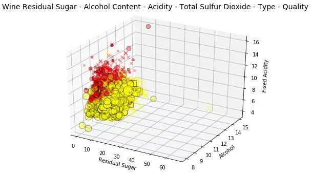
我們照舊遵從上文提出的策略,要想視覺化 5 維資料,我們要利用各種繪圖元件。我們使用深度、色調、大小來表徵其中的三個維度。其它兩維仍為常規軸。因為我們還會用到大小這個概念,並藉此畫出一個三維氣泡圖。
# Visualizing 5-D mix data using bubble charts
# leveraging the concepts of hue, size and depth
fig = plt.figure(figsize=(8, 6))
ax = fig.add_subplot(111, projection=’3d’)
t = fig.suptitle(‘Wine Residual Sugar – Alcohol Content – Acidity – Total Sulfur Dioxide – Type’, fontsize=14)
xs = list(wines[‘residual sugar’])
ys = list(wines[‘alcohol’])
zs = list(wines[‘fixed acidity’])
data_points = [(x, y, z) for x, y, z in zip(xs, ys, zs)]
ss = list(wines[‘total sulfur dioxide’])
colors = [‘red’ if wt == ‘red’ else ‘yellow’ for wt in list(wines[‘wine_type’])]
for data, color, size in zip(data_points, colors, ss):
x, y, z = data
ax.scatter(x, y, z, alpha=0.4, c=color, edgecolors=’none’, s=size)
ax.set_xlabel(‘Residual Sugar’)
ax.set_ylabel(‘Alcohol’)
ax.set_zlabel(‘Fixed Acidity’)

利用氣泡圖和色調、深度、大小的概念來視覺化 5 維資料
氣泡圖靈感來源與上文所述一致。但是,我們還可以看到以二氧化硫總量為指標的點數,發現白葡萄酒的二氧化硫含量高於紅葡萄酒。
除了深度之外,我們還可以使用分面和色調來表徵這五個資料維度中的多個分類屬性。其中表徵大小的屬性可以是數值表徵甚至是類別(但是我們可能要用它的數值表徵來表徵資料點大小)。由於缺乏類別屬性,此處我們不作展示,但是你可以在自己的資料集上試試。
# Visualizing 5-D mix data using bubble charts
# leveraging the concepts of hue, size and depth
fig = plt.figure(figsize=(8, 6))
ax = fig.add_subplot(111, projection=’3d’)
t = fig.suptitle(‘Wine Residual Sugar – Alcohol Content – Acidity – Total Sulfur Dioxide – Type’, fontsize=14)
xs = list(wines[‘residual sugar’])
ys = list(wines[‘alcohol’])
zs = list(wines[‘fixed acidity’])
data_points = [(x, y, z) for x, y, z in zip(xs, ys, zs)]
ss = list(wines[‘total sulfur dioxide’])
colors = [‘red’ if wt == ‘red’ else ‘yellow’ for wt in list(wines[‘wine_type’])]
for data, color, size in zip(data_points, colors, ss):
x, y, z = data
ax.scatter(x, y, z, alpha=0.4, c=color, edgecolors=’none’, s=size)
ax.set_xlabel(‘Residual Sugar’)
ax.set_ylabel(‘Alcohol’)
ax.set_zlabel(‘Fixed Acidity’)

藉助色調、分面、大小的概念和氣泡圖來視覺化 5 維資料。
通常還有一個前文介紹的 5 維資料視覺化的備選方法。當看到我們先前繪製的圖時,很多人可能會對多出來的維度深度困惑。該圖重覆利用了分面的特性,所以仍可以在 2 維面板上繪製出來且易於說明和繪製。

我們已經領略到多位資料視覺化的複雜性!如果還有人想問,為何不增加維度?讓我們繼續簡單探索下!
視覺化 6 維資料(6-D)
目前我們畫得很開心(我希望是如此!)我們繼續在視覺化中新增一個資料維度。我們將利用深度、色調、大小和形狀及兩個常規軸來描述所有 6 個資料維度。
我們將利用散點圖和色調、深度、形狀、大小的概念來視覺化 6 維資料。
# Visualizing 6-D mix data using scatter charts
# leveraging the concepts of hue, size, depth and shape
fig = plt.figure(figsize=(8, 6))
t = fig.suptitle(‘Wine Residual Sugar – Alcohol Content – Acidity – Total Sulfur Dioxide – Type – Quality’, fontsize=14)
ax = fig.add_subplot(111, projection=’3d’)
xs = list(wines[‘residual sugar’])
ys = list(wines[‘alcohol’])
zs = list(wines[‘fixed acidity’])
data_points = [(x, y, z) for x, y, z in zip(xs, ys, zs)]
ss = list(wines[‘total sulfur dioxide’])
colors = [‘red’ if wt == ‘red’ else ‘yellow’ for wt in list(wines[‘wine_type’])]
markers = [‘,’ if q == ‘high’ else ‘x’ if q == ‘medium’ else ‘o’ for q in list(wines[‘quality_label’])]
for data, color, size, mark in zip(data_points, colors, ss, markers):
x, y, z = data
ax.scatter(x, y, z, alpha=0.4, c=color, edgecolors=’none’, s=size, marker=mark)
ax.set_xlabel(‘Residual Sugar’)
ax.set_ylabel(‘Alcohol’)
ax.set_zlabel(‘Fixed Acidity’)
這可是在一張圖上畫出 6 維資料!我們用形狀表徵葡萄酒的質量標註,優質(用方塊標記),一般(用 x 標記),差(用圓標記):用色調表示紅酒的型別,由深度和資料點大小確定的酸度表徵總二氧化硫含量。
這個解釋起來可能有點費勁,但是在試圖理解多維資料的隱藏資訊時,最好結合一些繪圖元件將其視覺化。
-
結合形狀和 y 軸的表現,我們知道高中檔的葡萄酒的酒精含量比低質葡萄酒更高。
-
結合色調和大小的表現,我們知道白葡萄酒的總二氧化硫含量比紅葡萄酒更高。
-
結合深度和色調的表現,我們知道白葡萄酒的酸度比紅葡萄酒更低。
-
結合色調和 x 軸的表現,我們知道紅葡萄酒的殘糖比白葡萄酒更低。
-
結合色調和形狀的表現,似乎白葡萄酒的高品質產量高於紅葡萄酒。(可能是由於白葡萄酒的樣本量較大)
我們也可以用分面屬性來代替深度構建 6 維資料視覺化效果。
# Visualizing 6-D mix data using scatter charts
# leveraging the concepts of hue, facets and size
g = sns.FacetGrid(wines, row=’wine_type’, col=”quality”, hue=’quality_label’, size=4)
g.map(plt.scatter, “residual sugar”, “alcohol”, alpha=0.5,
edgecolor=’k’, linewidth=0.5, s=wines[‘total sulfur dioxide’]*2)
fig = g.fig
fig.set_size_inches(18, 8)
fig.subplots_adjust(top=0.85, wspace=0.3)
fig.suptitle(‘Wine Type – Sulfur Dioxide – Residual Sugar – Alcohol – Quality Class – Quality Rating’, fontsize=14)
l = g.add_legend(title=’Wine Quality Class’)
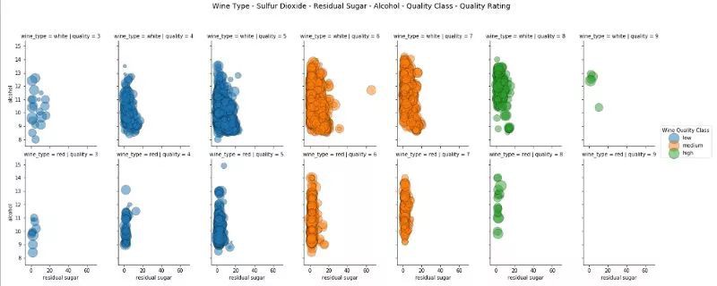
藉助色調、深度、面、大小的概念和散點圖來視覺化 6 維資料。
因此,在這種情況下,我們利用分面和色調來表徵三個分類屬性,並使用兩個常規軸和大小來表徵 6 維資料視覺化的三個數值屬性。
06 結論
資料視覺化與科學一樣重要。如果你看到這,我很欣慰你能堅持看完這篇長文。我們的目的不是為了記住所有資料,也不是給出一套固定的資料視覺化規則。本文的主要目的是理解並學習高效的資料視覺化策略,尤其是當資料維度增大時。希望你以後可以用本文知識視覺化你自己的資料集。
精彩活動
推薦閱讀
2017年資料視覺化的七大趨勢!
全球100款大資料工具彙總(前50款)
Q: 你在資料視覺化實踐中有哪些心得?
歡迎留言與大家分享
請把這篇文章分享給你的朋友
轉載 / 投稿請聯絡:hzzy@hzbook.com
更多精彩文章,請在公眾號後臺點選“歷史文章”檢視

