作者:Lemonbit
來源:Python資料之道(ID:PyDataRoad)
在資料分析和視覺化中最有用的 50 個 Matplotlib 圖表。這些圖表串列允許您使用 python 的 matplotlib 和 seaborn 庫選擇要顯示的視覺化物件。
-
介紹
這些圖表根據視覺化標的的7個不同情景進行分組。例如,如果要想象兩個變數之間的關係,請檢視“關聯”部分下的圖表。或者,如果您想要顯示值如何隨時間變化,請檢視“變化”部分,依此類推。
有效圖表的重要特徵:
-
在不歪曲事實的情況下傳達正確和必要的資訊。
-
設計簡單,您不必太費力就能理解它。
-
從審美角度支援資訊而不是掩蓋資訊。
-
資訊沒有超負荷。
-
準備工作
在程式碼執行前先引入下麵的設定內容。當然,單獨的圖表,可以重新設定顯示要素。
-
# !pip install brewer2mpl -
import numpy as np -
import pandas as pd -
import matplotlib as mpl -
import matplotlib.pyplot as plt -
import seaborn as sns -
import warnings; warnings.filterwarnings(action='once') -
-
large = 22; med = 16; small = 12 -
params = {'axes.titlesize': large, -
'legend.fontsize': med, -
'figure.figsize': (16, 10), -
'axes.labelsize': med, -
'axes.titlesize': med, -
'xtick.labelsize': med, -
'ytick.labelsize': med, -
'figure.titlesize': large} -
plt.rcParams.update(params) -
plt.style.use('seaborn-whitegrid') -
sns.set_style("white") -
%matplotlib inline -
-
# Version -
print(mpl.__version__) #> 3.0.0 -
print(sns.__version__) #> 0.9.0
-
3.0.2 -
0.9.0
01 關聯 (Correlation)
關聯圖表用於視覺化2個或更多變數之間的關係。也就是說,一個變數如何相對於另一個變化。
1. 散點圖(Scatter plot)
散點圖是用於研究兩個變數之間關係的經典的和基本的圖表。如果資料中有多個組,則可能需要以不同顏色視覺化每個組。在 matplotlib 中,您可以使用 plt.scatterplot() 方便地執行此操作。
-
midwest = pd.read_csv("https://raw.githubusercontent.com/selva86/datasets/master/midwest_filter.csv") -
-
# Prepare Data -
# Create as many colors as there are unique midwest['category'] -
categories = np.unique(midwest['category']) -
colors = [plt.cm.tab10(i/float(len(categories)-1)) for i in range(len(categories))] -
-
# Draw Plot for Each Category -
plt.figure(figsize=(16, 10), dpi= 80, facecolor='w', edgecolor='k') -
-
for i, category in enumerate(categories): -
plt.scatter('area', 'poptotal', -
data=midwest.loc[midwest.category==category, :], -
s=20, cmap=colors[i], label=str(category)) -
# "c=" 修改為 "cmap=",Python資料之道 備註 -
-
# Decorations -
plt.gca().set(xlim=(0.0, 0.1), ylim=(0, 90000), -
xlabel='Area', ylabel='Population') -
-
plt.xticks(fontsize=12); plt.yticks(fontsize=12) -
plt.title("Scatterplot of Midwest Area vs Population", fontsize=22) -
plt.legend(fontsize=12) -
plt.show()
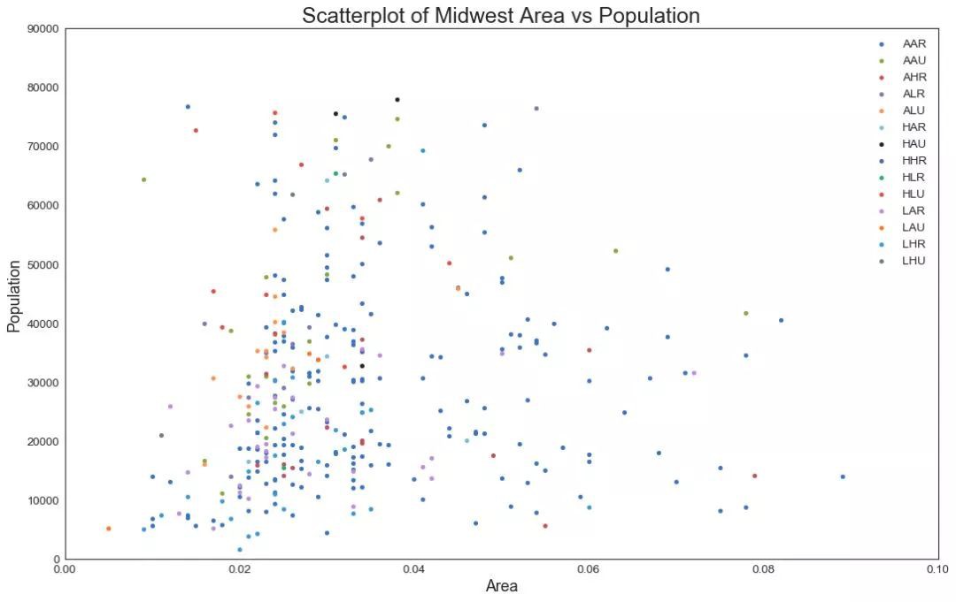
▲圖1
2. 帶邊界的氣泡圖(Bubble plot with Encircling)
有時,您希望在邊界內顯示一組點以強調其重要性。在這個例子中,你從資料框中獲取記錄,並用下麵程式碼中描述的 encircle() 來使邊界顯示出來。
-
from matplotlib import patches -
from scipy.spatial import ConvexHull -
import warnings; warnings.simplefilter('ignore') -
sns.set_style("white") -
-
# Step 1: Prepare Data -
midwest = pd.read_csv("https://raw.githubusercontent.com/selva86/datasets/master/midwest_filter.csv") -
-
# As many colors as there are unique midwest['category'] -
categories = np.unique(midwest['category']) -
colors = [plt.cm.tab10(i/float(len(categories)-1)) for i in range(len(categories))] -
-
# Step 2: Draw Scatterplot with unique color for each category -
fig = plt.figure(figsize=(16, 10), dpi= 80, facecolor='w', edgecolor='k') -
-
for i, category in enumerate(categories): -
plt.scatter('area', 'poptotal', data=midwest.loc[midwest.category==category, :], -
s='dot_size', cmap=colors[i], label=str(category), edgecolors='black', linewidths=.5) -
# "c=" 修改為 "cmap=",Python資料之道 備註 -
-
# Step 3: Encircling -
# https://stackoverflow.com/questions/44575681/how-do-i-encircle-different-data-sets-in-scatter-plot -
def encircle(x,y, ax=None, **kw): -
if not ax: ax=plt.gca() -
p = np.c_[x,y] -
hull = ConvexHull(p) -
poly = plt.Polygon(p[hull.vertices,:], **kw) -
ax.add_patch(poly) -
-
# Select data to be encircled -
midwest_encircle_data = midwest.loc[midwest.state=='IN', :] -
-
# Draw polygon surrounding vertices -
encircle(midwest_encircle_data.area, midwest_encircle_data.poptotal, ec="k", fc="gold", alpha=0.1) -
encircle(midwest_encircle_data.area, midwest_encircle_data.poptotal, ec="firebrick", fc="none", linewidth=1.5) -
-
# Step 4: Decorations -
plt.gca().set(xlim=(0.0, 0.1), ylim=(0, 90000), -
xlabel='Area', ylabel='Population') -
-
plt.xticks(fontsize=12); plt.yticks(fontsize=12) -
plt.title("Bubble Plot with Encircling", fontsize=22) -
plt.legend(fontsize=12) -
plt.show()

▲圖2
3. 帶線性回歸最佳擬合線的散點圖 (Scatter plot with linear regression line of best fit)
如果你想瞭解兩個變數如何相互改變,那麼最佳擬合線就是常用的方法。下圖顯示了資料中各組之間最佳擬合線的差異。要禁用分組並僅為整個資料集繪製一條最佳擬合線,請從下麵的 sns.lmplot()呼叫中刪除 hue =’cyl’引數。
-
# Import Data -
df = pd.read_csv("https://raw.githubusercontent.com/selva86/datasets/master/mpg_ggplot2.csv") -
df_select = df.loc[df.cyl.isin([4,8]), :] -
-
# Plot -
sns.set_style("white") -
gridobj = sns.lmplot(x="displ", y="hwy", hue="cyl", data=df_select, -
height=7, aspect=1.6, robust=True, palette='tab10', -
scatter_kws=dict(s=60, linewidths=.7, edgecolors='black')) -
-
# Decorations -
gridobj.set(xlim=(0.5, 7.5), ylim=(0, 50)) -
plt.title("Scatterplot with line of best fit grouped by number of cylinders", fontsize=20) -
plt.show()
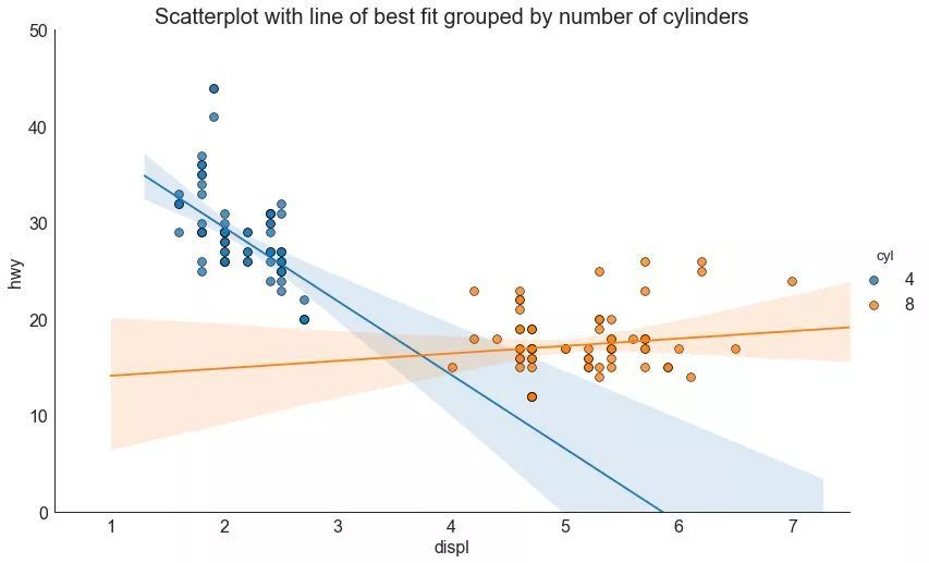
▲圖3
-
針對每列繪製線性回歸線
或者,可以在其每列中顯示每個組的最佳擬合線。可以透過在 sns.lmplot() 中設定 col=groupingcolumn 引數來實現,如下:
-
# Import Data -
df = pd.read_csv("https://raw.githubusercontent.com/selva86/datasets/master/mpg_ggplot2.csv") -
df_select = df.loc[df.cyl.isin([4,8]), :] -
-
# Each line in its own column -
sns.set_style("white") -
gridobj = sns.lmplot(x="displ", y="hwy", -
data=df_select, -
height=7, -
robust=True, -
palette='Set1', -
col="cyl", -
scatter_kws=dict(s=60, linewidths=.7, edgecolors='black')) -
-
# Decorations -
gridobj.set(xlim=(0.5, 7.5), ylim=(0, 50)) -
plt.show()

▲圖3-2
4. 抖動圖 (Jittering with stripplot)
通常,多個資料點具有完全相同的 X 和 Y 值。 結果,多個點繪製會重疊並隱藏。為避免這種情況,請將資料點稍微抖動,以便您可以直觀地看到它們。使用 seaborn 的 stripplot() 很方便實現這個功能。
-
# Import Data -
df = pd.read_csv("https://raw.githubusercontent.com/selva86/datasets/master/mpg_ggplot2.csv") -
-
# Draw Stripplot -
fig, ax = plt.subplots(figsize=(16,10), dpi= 80) -
sns.stripplot(df.cty, df.hwy, jitter=0.25, size=8, ax=ax, linewidth=.5) -
-
# Decorations -
plt.title('Use jittered plots to avoid overlapping of points', fontsize=22) -
plt.show()
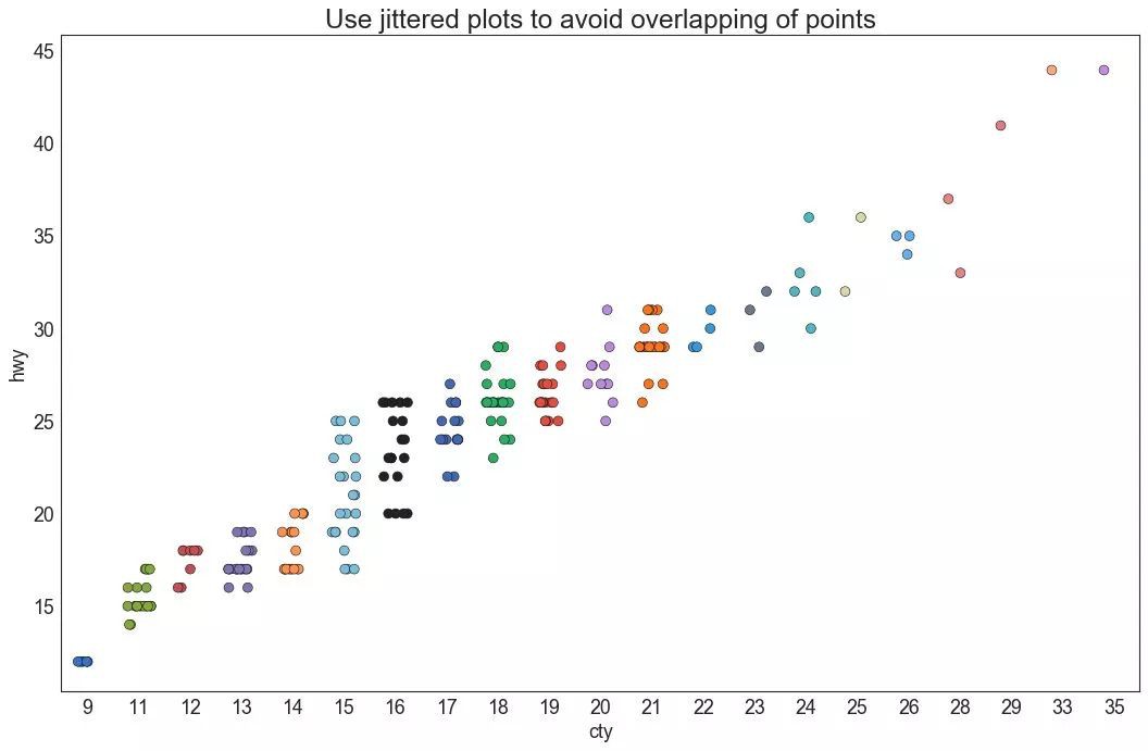
▲圖4
5. 計數圖 (Counts Plot)
避免點重疊問題的另一個選擇是增加點的大小,這取決於該點中有多少點。因此,點的大小越大,其周圍的點的集中度越高。
-
# Import Data -
df = pd.read_csv("https://raw.githubusercontent.com/selva86/datasets/master/mpg_ggplot2.csv") -
df_counts = df.groupby(['hwy', 'cty']).size().reset_index(name='counts') -
-
# Draw Stripplot -
fig, ax = plt.subplots(figsize=(16,10), dpi= 80) -
sns.stripplot(df_counts.cty, df_counts.hwy, size=df_counts.counts*2, ax=ax) -
-
# Decorations -
plt.title('Counts Plot - Size of circle is bigger as more points overlap', fontsize=22) -
plt.show()
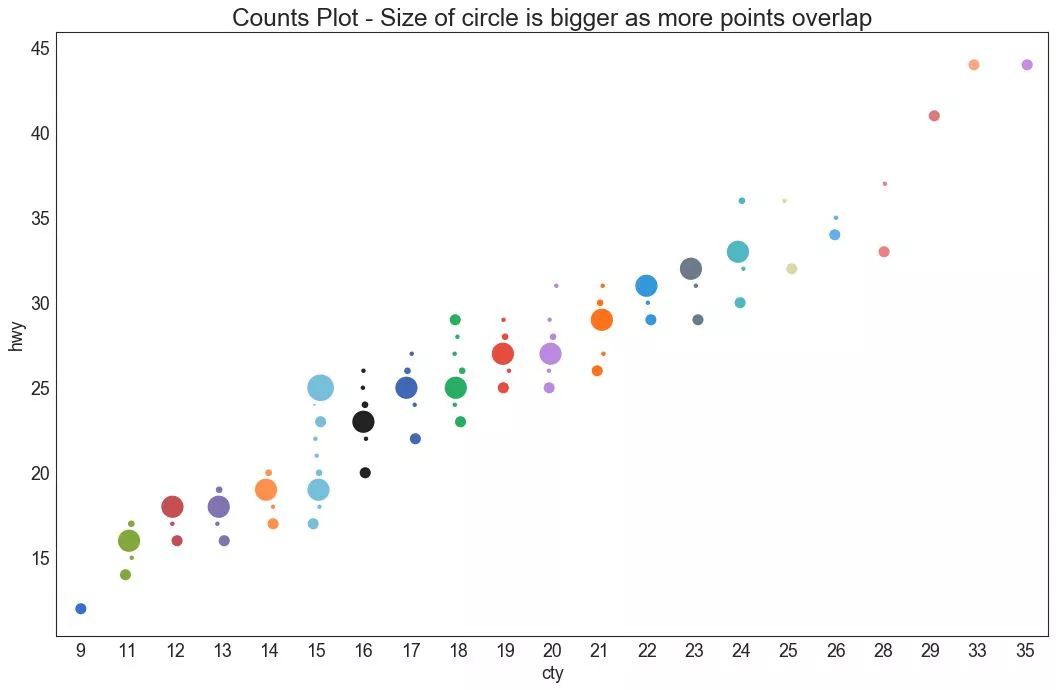
▲圖5
6. 邊緣直方圖 (Marginal Histogram)
邊緣直方圖具有沿 X 和 Y 軸變數的直方圖。 這用於視覺化 X 和 Y 之間的關係以及單獨的 X 和 Y 的單變數分佈。 這種圖經常用於探索性資料分析(EDA)。
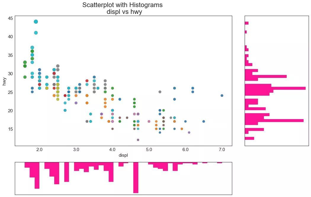
▲圖6
7. 邊緣箱形圖 (Marginal Boxplot)
邊緣箱圖與邊緣直方圖具有相似的用途。然而,箱線圖有助於精確定位 X 和 Y 的中位數、第25和第75百分位數。
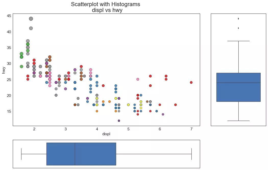
▲圖7
8. 相關圖 (Correllogram)
相關圖用於直觀地檢視給定資料框(或二維陣列)中所有可能的數值變數對之間的相關度量。
-
# Import Dataset -
df = pd.read_csv("https://github.com/selva86/datasets/raw/master/mtcars.csv") -
-
# Plot -
plt.figure(figsize=(12,10), dpi= 80) -
sns.heatmap(df.corr(), xticklabels=df.corr().columns, yticklabels=df.corr().columns, cmap='RdYlGn', center=0, annot=True) -
-
# Decorations -
plt.title('Correlogram of mtcars', fontsize=22) -
plt.xticks(fontsize=12) -
plt.yticks(fontsize=12) -
plt.show()

▲圖8
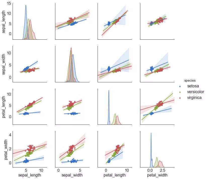
9. 矩陣圖 (Pairwise Plot)
矩陣圖是探索性分析中的最愛,用於理解所有可能的數值變數對之間的關係。它是雙變數分析的必備工具。
-
# Load Dataset -
df = sns.load_dataset('iris') -
-
# Plot -
plt.figure(figsize=(10,8), dpi= 80) -
sns.pairplot(df, kind="scatter", hue="species", plot_kws=dict(s=80, edgecolor="white", linewidth=2.5)) -
plt.show()

▲圖9
-
# Load Dataset -
df = sns.load_dataset('iris') -
-
# Plot -
plt.figure(figsize=(10,8), dpi= 80) -
sns.pairplot(df, kind="reg", hue="species") -
plt.show()
▲圖9-2
02 偏差 (Deviation)
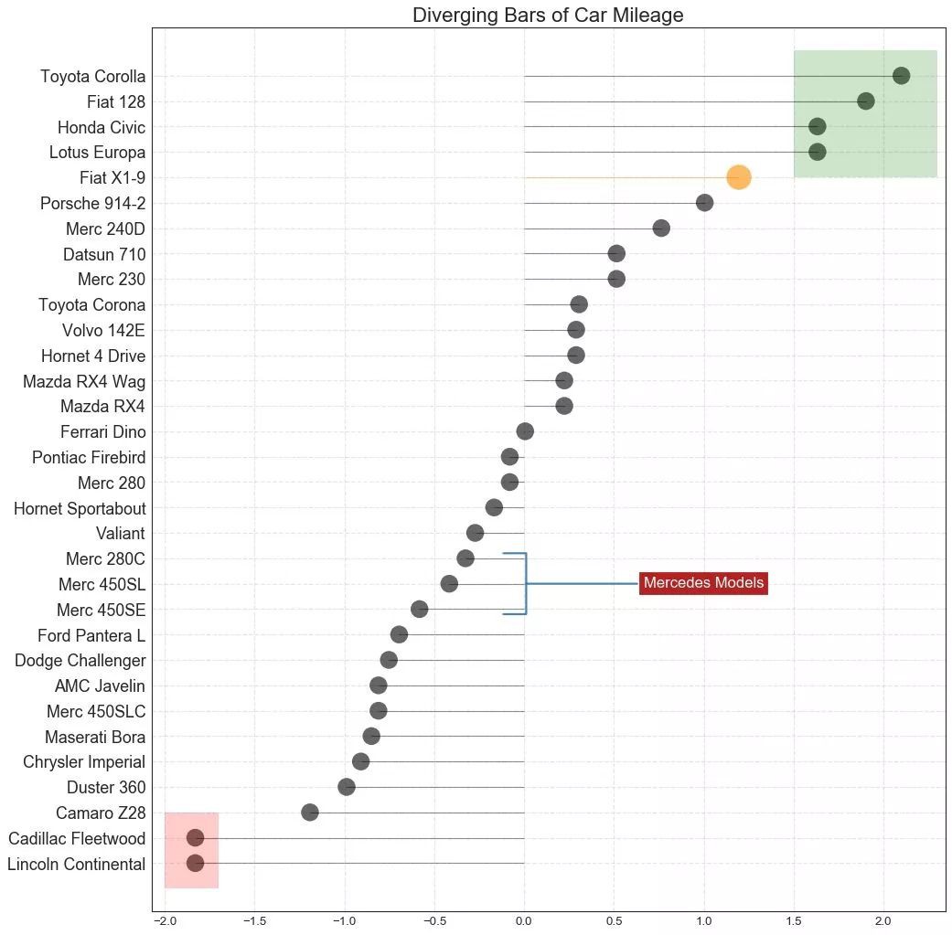
10. 發散型條形圖 (Diverging Bars)
如果您想根據單個指標檢視專案的變化情況,並視覺化此差異的順序和數量,那麼散型條形圖 (Diverging Bars) 是一個很好的工具。它有助於快速區分資料中組的效能,並且非常直觀,並且可以立即傳達這一點。
-
# Prepare Data -
df = pd.read_csv("https://github.com/selva86/datasets/raw/master/mtcars.csv") -
x = df.loc[:, ['mpg']] -
df['mpg_z'] = (x - x.mean())/x.std() -
df['colors'] = ['red' if x < 0 else 'green' for x in df['mpg_z']] -
df.sort_values('mpg_z', inplace=True) -
df.reset_index(inplace=True) -
-
# Draw plot -
plt.figure(figsize=(14,10), dpi= 80) -
plt.hlines(y=df.index, xmin=0, xmax=df.mpg_z, color=df.colors, alpha=0.4, linewidth=5) -
-
# Decorations -
plt.gca().set(ylabel='$Model$', xlabel='$Mileage$') -
plt.yticks(df.index, df.cars, fontsize=12) -
plt.title('Diverging Bars of Car Mileage', fontdict={'size':20}) -
plt.grid(linestyle='--', alpha=0.5) -
plt.show()

▲圖10
11. 發散型文字 (Diverging Texts)
發散型文字 (Diverging Texts)與發散型條形圖 (Diverging Bars)相似,如果你想以一種漂亮和可呈現的方式顯示圖表中每個專案的價值,就可以使用這種方法。
-
# Prepare Data -
df = pd.read_csv("https://github.com/selva86/datasets/raw/master/mtcars.csv") -
x = df.loc[:, ['mpg']] -
df['mpg_z'] = (x - x.mean())/x.std() -
df['colors'] = ['red' if x < 0 else 'green' for x in df['mpg_z']] -
df.sort_values('mpg_z', inplace=True) -
df.reset_index(inplace=True) -
-
# Draw plot -
plt.figure(figsize=(14,14), dpi= 80) -
plt.hlines(y=df.index, xmin=0, xmax=df.mpg_z) -
for x, y, tex in zip(df.mpg_z, df.index, df.mpg_z): -
t = plt.text(x, y, round(tex, 2), horizontalalignment='right' if x < 0 else 'left', -
verticalalignment='center', fontdict={'color':'red' if x < 0 else 'green', 'size':14}) -
-
# Decorations -
plt.yticks(df.index, df.cars, fontsize=12) -
plt.title('Diverging Text Bars of Car Mileage', fontdict={'size':20}) -
plt.grid(linestyle='--', alpha=0.5) -
plt.xlim(-2.5, 2.5) -
plt.show()

▲圖11
12. 發散型包點圖 (Diverging Dot Plot)
發散型包點圖 (Diverging Dot Plot)也類似於發散型條形圖 (Diverging Bars)。然而,與發散型條形圖 (Diverging Bars)相比,條的缺失減少了組之間的對比度和差異。
-
# Prepare Data -
df = pd.read_csv("https://github.com/selva86/datasets/raw/master/mtcars.csv") -
x = df.loc[:, ['mpg']] -
df['mpg_z'] = (x - x.mean())/x.std() -
df['colors'] = ['red' if x < 0 else 'darkgreen' for x in df['mpg_z']] -
df.sort_values('mpg_z', inplace=True) -
df.reset_index(inplace=True) -
-
# Draw plot -
plt.figure(figsize=(14,16), dpi= 80) -
plt.scatter(df.mpg_z, df.index, s=450, alpha=.6, color=df.colors) -
for x, y, tex in zip(df.mpg_z, df.index, df.mpg_z): -
t = plt.text(x, y, round(tex, 1), horizontalalignment='center', -
verticalalignment='center', fontdict={'color':'white'}) -
-
# Decorations -
# Lighten borders -
plt.gca().spines["top"].set_alpha(.3) -
plt.gca().spines["bottom"].set_alpha(.3) -
plt.gca().spines["right"].set_alpha(.3) -
plt.gca().spines["left"].set_alpha(.3) -
-
plt.yticks(df.index, df.cars) -
plt.title('Diverging Dotplot of Car Mileage', fontdict={'size':20}) -
plt.xlabel('$Mileage$') -
plt.grid(linestyle='--', alpha=0.5) -
plt.xlim(-2.5, 2.5) -
plt.show()
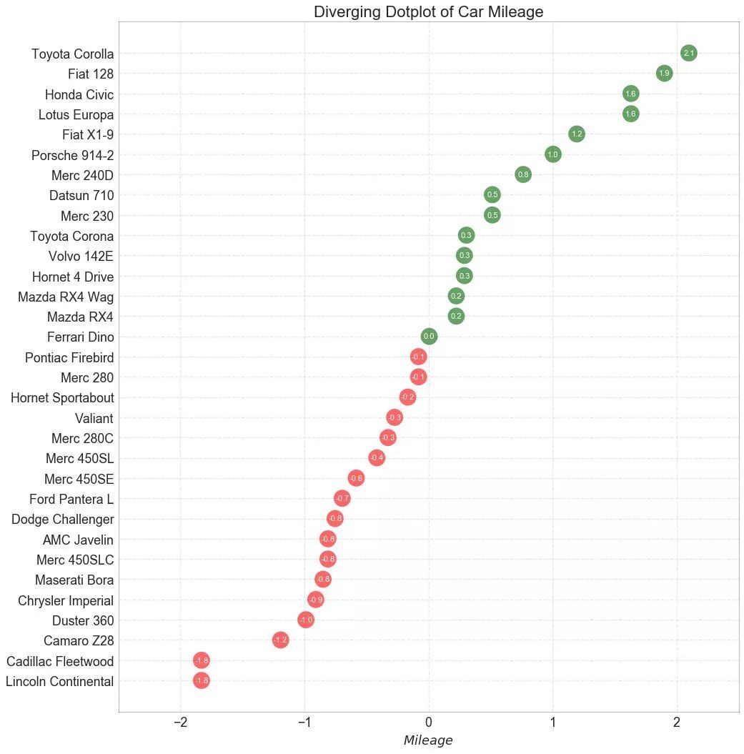
▲圖12
13. 帶標記的發散型棒棒糖圖 (Diverging Lollipop Chart with Markers)
帶標記的棒棒糖圖透過強調您想要引起註意的任何重要資料點併在圖表中適當地給出推理,提供了一種對差異進行視覺化的靈活方式。
▲圖13
14. 面積圖 (Area Chart)
透過對軸和線之間的區域進行著色,面積圖不僅強調峰和谷,而且還強調高點和低點的持續時間。高點持續時間越長,線下麵積越大。
-
import numpy as np -
import pandas as pd -
-
# Prepare Data -
df = pd.read_csv("https://github.com/selva86/datasets/raw/master/economics.csv", parse_dates=['date']).head(100) -
x = np.arange(df.shape[0]) -
y_returns = (df.psavert.diff().fillna(0)/df.psavert.shift(1)).fillna(0) * 100 -
-
# Plot -
plt.figure(figsize=(16,10), dpi= 80) -
plt.fill_between(x[1:], y_returns[1:], 0, where=y_returns[1:] >= 0, facecolor='green', interpolate=True, alpha=0.7) -
plt.fill_between(x[1:], y_returns[1:], 0, where=y_returns[1:] <= 0, facecolor='red', interpolate=True, alpha=0.7) -
-
# Annotate -
plt.annotate('Peak \n1975', xy=(94.0, 21.0), xytext=(88.0, 28), -
bbox=dict(boxstyle='square', fc='firebrick'), -
arrowprops=dict(facecolor='steelblue', shrink=0.05), fontsize=15, color='white') -
-
-
# Decorations -
xtickvals = [str(m)[:3].upper()+"-"+str(y) for y,m in zip(df.date.dt.year, df.date.dt.month_name())] -
plt.gca().set_xticks(x[::6]) -
plt.gca().set_xticklabels(xtickvals[::6], rotation=90, fontdict={'horizontalalignment': 'center', 'verticalalignment': 'center_baseline'}) -
plt.ylim(-35,35) -
plt.xlim(1,100) -
plt.title("Month Economics Return %", fontsize=22) -
plt.ylabel('Monthly returns %') -
plt.grid(alpha=0.5) -
plt.show()
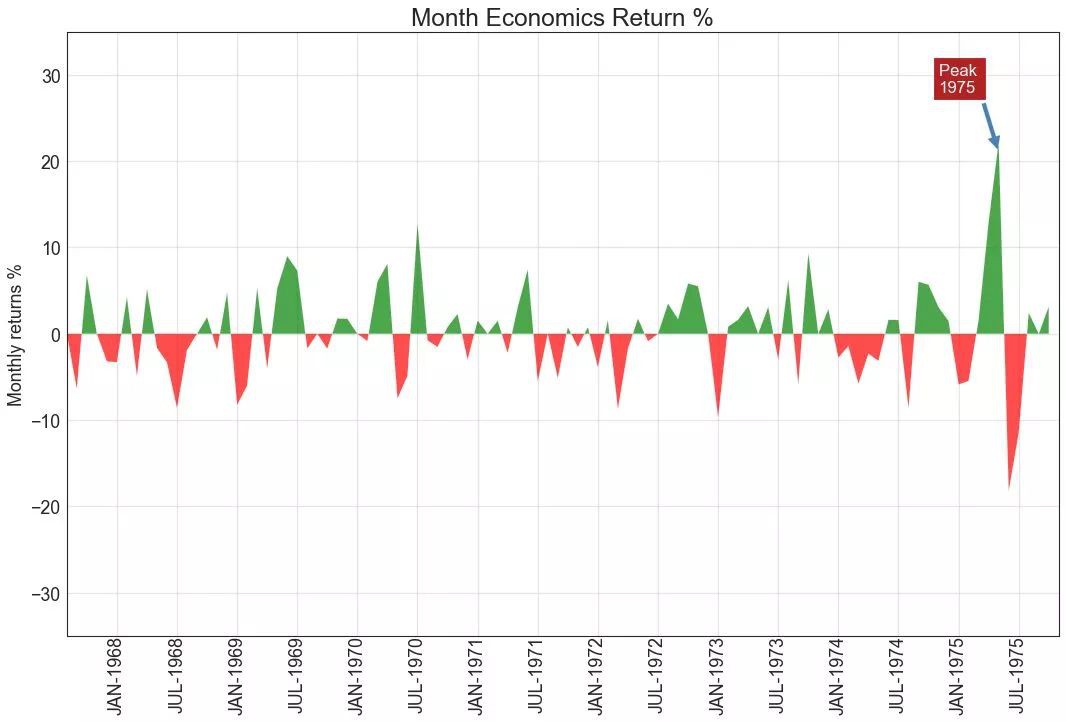
▲圖14
03 排序 (Ranking)
15. 有序條形圖 (Ordered Bar Chart)
有序條形圖有效地傳達了專案的排名順序。但是,在圖表上方新增度量標準的值,使用者可以從圖表本身獲取精確資訊。
▲圖15
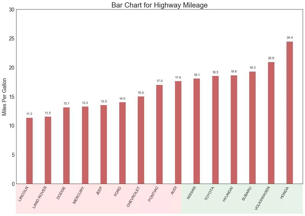
16. 棒棒糖圖 (Lollipop Chart)
棒棒糖圖表以一種視覺上令人愉悅的方式提供與有序條形圖類似的目的。
-
# Prepare Data -
df_raw = pd.read_csv("https://github.com/selva86/datasets/raw/master/mpg_ggplot2.csv") -
df = df_raw[['cty', 'manufacturer']].groupby('manufacturer').apply(lambda x: x.mean()) -
df.sort_values('cty', inplace=True) -
df.reset_index(inplace=True) -
-
# Draw plot -
fig, ax = plt.subplots(figsize=(16,10), dpi= 80) -
ax.vlines(x=df.index, ymin=0, ymax=df.cty, color='firebrick', alpha=0.7, linewidth=2) -
ax.scatter(x=df.index, y=df.cty, s=75, color='firebrick', alpha=0.7) -
-
# Title, Label, Ticks and Ylim -
ax.set_title('Lollipop Chart for Highway Mileage', fontdict={'size':22}) -
ax.set_ylabel('Miles Per Gallon') -
ax.set_xticks(df.index) -
ax.set_xticklabels(df.manufacturer.str.upper(), rotation=60, fontdict={'horizontalalignment': 'right', 'size':12}) -
ax.set_ylim(0, 30) -
-
# Annotate -
for row in df.itertuples(): -
ax.text(row.Index, row.cty+.5, s=round(row.cty, 2), horizontalalignment= 'center', verticalalignment='bottom', fontsize=14) -
-
plt.show()

▲圖16
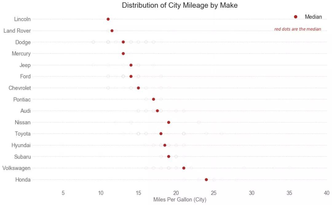
17. 包點圖 (Dot Plot)
包點圖表傳達了專案的排名順序,並且由於它沿水平軸對齊,因此您可以更容易地看到點彼此之間的距離。
-
# Prepare Data -
df_raw = pd.read_csv("https://github.com/selva86/datasets/raw/master/mpg_ggplot2.csv") -
df = df_raw[['cty', 'manufacturer']].groupby('manufacturer').apply(lambda x: x.mean()) -
df.sort_values('cty', inplace=True) -
df.reset_index(inplace=True) -
-
# Draw plot -
fig, ax = plt.subplots(figsize=(16,10), dpi= 80) -
ax.hlines(y=df.index, xmin=11, xmax=26, color='gray', alpha=0.7, linewidth=1, linestyles='dashdot') -
ax.scatter(y=df.index, x=df.cty, s=75, color='firebrick', alpha=0.7) -
-
# Title, Label, Ticks and Ylim -
ax.set_title('Dot Plot for Highway Mileage', fontdict={'size':22}) -
ax.set_xlabel('Miles Per Gallon') -
ax.set_yticks(df.index) -
ax.set_yticklabels(df.manufacturer.str.title(), fontdict={'horizontalalignment': 'right'}) -
ax.set_xlim(10, 27) -
plt.show()

▲圖17
18. 坡度圖 (Slope Chart)
坡度圖最適合比較給定人/專案的“前”和“後”位置。
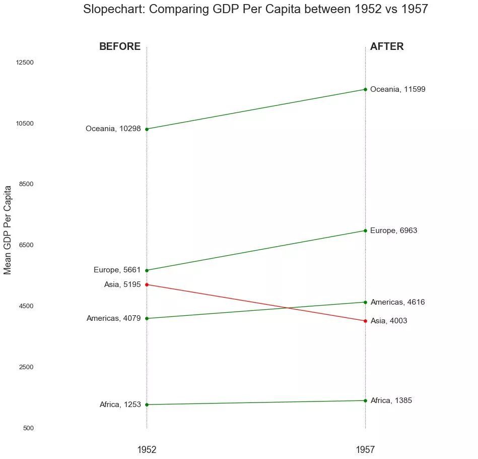
▲圖18
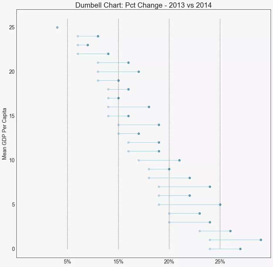
19. 啞鈴圖 (Dumbbell Plot)
啞鈴圖表傳達了各種專案的“前”和“後”位置以及專案的等級排序。如果您想要將特定專案/計劃對不同物件的影響視覺化,那麼它非常有用。
▲圖19
04 分佈 (Distribution)
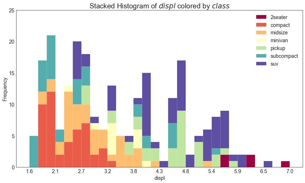
20. 連續變數的直方圖 (Histogram for Continuous Variable)
直方圖顯示給定變數的頻率分佈。下麵的圖表示基於型別變數對頻率條進行分組,從而更好地瞭解連續變數和型別變數。
-
# Import Data -
df = pd.read_csv("https://github.com/selva86/datasets/raw/master/mpg_ggplot2.csv") -
-
# Prepare data -
x_var = 'displ' -
groupby_var = 'class' -
df_agg = df.loc[:, [x_var, groupby_var]].groupby(groupby_var) -
vals = [df[x_var].values.tolist() for i, df in df_agg] -
-
# Draw -
plt.figure(figsize=(16,9), dpi= 80) -
colors = [plt.cm.Spectral(i/float(len(vals)-1)) for i in range(len(vals))] -
n, bins, patches = plt.hist(vals, 30, stacked=True, density=False, color=colors[:len(vals)]) -
-
# Decoration -
plt.legend({group:col for group, col in zip(np.unique(df[groupby_var]).tolist(), colors[:len(vals)])}) -
plt.title(f"Stacked Histogram of ${x_var}$ colored by ${groupby_var}$", fontsize=22) -
plt.xlabel(x_var) -
plt.ylabel("Frequency") -
plt.ylim(0, 25) -
plt.xticks(ticks=bins[::3], labels=[round(b,1) for b in bins[::3]]) -
plt.show()
▲圖20
21. 型別變數的直方圖 (Histogram for Categorical Variable)
型別變數的直方圖顯示該變數的頻率分佈。透過對條形圖進行著色,可以將分佈與表示顏色的另一個型別變數相關聯。
-
# Import Data -
df = pd.read_csv("https://github.com/selva86/datasets/raw/master/mpg_ggplot2.csv") -
-
# Prepare data -
x_var = 'manufacturer' -
groupby_var = 'class' -
df_agg = df.loc[:, [x_var, groupby_var]].groupby(groupby_var) -
vals = [df[x_var].values.tolist() for i, df in df_agg] -
-
# Draw -
plt.figure(figsize=(16,9), dpi= 80) -
colors = [plt.cm.Spectral(i/float(len(vals)-1)) for i in range(len(vals))] -
n, bins, patches = plt.hist(vals, df[x_var].unique().__len__(), stacked=True, density=False, color=colors[:len(vals)]) -
-
# Decoration -
plt.legend({group:col for group, col in zip(np.unique(df[groupby_var]).tolist(), colors[:len(vals)])}) -
plt.title(f"Stacked Histogram of ${x_var}$ colored by ${groupby_var}$", fontsize=22) -
plt.xlabel(x_var) -
plt.ylabel("Frequency") -
plt.ylim(0, 40) -
plt.xticks(ticks=bins, labels=np.unique(df[x_var]).tolist(), rotation=90, horizontalalignment='left') -
plt.show()

▲圖21
22. 密度圖 (Density Plot)
密度圖是一種常用工具,用於視覺化連續變數的分佈。透過“響應”變數對它們進行分組,您可以檢查 X 和 Y 之間的關係。以下情況用於表示目的,以描述城市裡程的分佈如何隨著汽缸數的變化而變化。
-
# Import Data -
df = pd.read_csv("https://github.com/selva86/datasets/raw/master/mpg_ggplot2.csv") -
-
# Draw Plot -
plt.figure(figsize=(16,10), dpi= 80) -
sns.kdeplot(df.loc[df['cyl'] == 4, "cty"], shade=True, color="g", label="Cyl=4", alpha=.7) -
sns.kdeplot(df.loc[df['cyl'] == 5, "cty"], shade=True, color="deeppink", label="Cyl=5", alpha=.7) -
sns.kdeplot(df.loc[df['cyl'] == 6, "cty"], shade=True, color="dodgerblue", label="Cyl=6", alpha=.7) -
sns.kdeplot(df.loc[df['cyl'] == 8, "cty"], shade=True, color="orange", label="Cyl=8", alpha=.7) -
-
# Decoration -
plt.title('Density Plot of City Mileage by n_Cylinders', fontsize=22) -
plt.legend() -
plt.show()

▲圖22
23. 直方密度線圖 (Density Curves with Histogram)
帶有直方圖的密度曲線彙集了兩個圖所傳達的集體資訊,因此您可以將它們放在一個圖中而不是兩個圖中。
-
# Import Data -
df = pd.read_csv("https://github.com/selva86/datasets/raw/master/mpg_ggplot2.csv") -
-
# Draw Plot -
plt.figure(figsize=(13,10), dpi= 80) -
sns.distplot(df.loc[df['class'] == 'compact', "cty"], color="dodgerblue", label="Compact", hist_kws={'alpha':.7}, kde_kws={'linewidth':3}) -
sns.distplot(df.loc[df['class'] == 'suv', "cty"], color="orange", label="SUV", hist_kws={'alpha':.7}, kde_kws={'linewidth':3}) -
sns.distplot(df.loc[df['class'] == 'minivan', "cty"], color="g", label="minivan", hist_kws={'alpha':.7}, kde_kws={'linewidth':3}) -
plt.ylim(0, 0.35) -
-
# Decoration -
plt.title('Density Plot of City Mileage by Vehicle Type', fontsize=22) -
plt.legend() -
plt.show()

▲圖23
24. Joy Plot
Joy Plot允許不同組的密度曲線重疊,這是一種視覺化大量分組資料的彼此關係分佈的好方法。它看起來很悅目,並清楚地傳達了正確的資訊。它可以使用基於 matplotlib 的 joypy 包輕鬆構建。(註:需要安裝 joypy 庫)
-
# !pip install joypy -
# Python資料之道 備註 -
import joypy -
-
# Import Data -
mpg = pd.read_csv("https://github.com/selva86/datasets/raw/master/mpg_ggplot2.csv") -
-
# Draw Plot -
plt.figure(figsize=(16,10), dpi= 80) -
fig, axes = joypy.joyplot(mpg, column=['hwy', 'cty'], by="class", ylim='own', figsize=(14,10)) -
-
# Decoration -
plt.title('Joy Plot of City and Highway Mileage by Class', fontsize=22) -
plt.show()

▲圖24
25. 分散式包點圖 (Distributed Dot Plot)
分散式包點圖顯示按組分割的點的單變數分佈。點數越暗,該區域的資料點集中度越高。透過對中位數進行不同著色,組的真實定位立即變得明顯。
▲圖25
26. 箱形圖 (Box Plot)
箱形圖是一種視覺化分佈的好方法,記住中位數、第25個第45個四分位數和異常值。但是,您需要註意解釋可能會扭曲該組中包含的點數的框的大小。因此,手動提供每個框中的觀察數量可以幫助剋服這個缺點。
例如,左邊的前兩個框具有相同大小的框,即使它們的值分別是5和47。因此,寫入該組中的觀察數量是必要的。
-
# Import Data -
df = pd.read_csv("https://github.com/selva86/datasets/raw/master/mpg_ggplot2.csv") -
-
# Draw Plot -
plt.figure(figsize=(13,10), dpi= 80) -
sns.boxplot(x='class', y='hwy', data=df, notch=False) -
-
# Add N Obs inside boxplot (optional) -
def add_n_obs(df,group_col,y): -
medians_dict = {grp[0]:grp[1][y].median() for grp in df.groupby(group_col)} -
xticklabels = [x.get_text() for x in plt.gca().get_xticklabels()] -
n_obs = df.groupby(group_col)[y].size().values -
for (x, xticklabel), n_ob in zip(enumerate(xticklabels), n_obs): -
plt.text(x, medians_dict[xticklabel]*1.01, "#obs : "+str(n_ob), horizontalalignment='center', fontdict={'size':14}, color='white') -
-
add_n_obs(df,group_col='class',y='hwy') -
-
# Decoration -
plt.title('Box Plot of Highway Mileage by Vehicle Class', fontsize=22) -
plt.ylim(10, 40) -
plt.show()

▲圖26
27. 包點+箱形圖 (Dot + Box Plot)
包點+箱形圖(Dot + Box Plot)傳達類似於分組的箱形圖資訊。此外,這些點可以瞭解每組中有多少資料點。
-
# Import Data -
df = pd.read_csv("https://github.com/selva86/datasets/raw/master/mpg_ggplot2.csv") -
-
# Draw Plot -
plt.figure(figsize=(13,10), dpi= 80) -
sns.boxplot(x='class', y='hwy', data=df, hue='cyl') -
sns.stripplot(x='class', y='hwy', data=df, color='black', size=3, jitter=1) -
-
for i in range(len(df['class'].unique())-1): -
plt.vlines(i+.5, 10, 45, linestyles='solid', colors='gray', alpha=0.2) -
-
# Decoration -
plt.title('Box Plot of Highway Mileage by Vehicle Class', fontsize=22) -
plt.legend(title='Cylinders') -
plt.show()

▲圖27
28. 小提琴圖 (Violin Plot)
小提琴圖是箱形圖在視覺上令人愉悅的替代品。小提琴的形狀或面積取決於它所持有的觀察次數。但是,小提琴圖可能更難以閱讀,並且在專業設定中不常用。
-
# Import Data -
df = pd.read_csv("https://github.com/selva86/datasets/raw/master/mpg_ggplot2.csv") -
-
# Draw Plot -
plt.figure(figsize=(13,10), dpi= 80) -
sns.violinplot(x='class', y='hwy', data=df, scale='width', inner='quartile') -
-
# Decoration -
plt.title('Violin Plot of Highway Mileage by Vehicle Class', fontsize=22) -
plt.show()

▲圖28
29. 人口金字塔 (Population Pyramid)
人口金字塔可用於顯示由數量排序的組的分佈。或者它也可以用於顯示人口的逐級過濾,因為它在下麵用於顯示有多少人透過營銷渠道的每個階段。
-
# Read data -
df = pd.read_csv("https://raw.githubusercontent.com/selva86/datasets/master/email_campaign_funnel.csv") -
-
# Draw Plot -
plt.figure(figsize=(13,10), dpi= 80) -
group_col = 'Gender' -
order_of_bars = df.Stage.unique()[::-1] -
colors = [plt.cm.Spectral(i/float(len(df[group_col].unique())-1)) for i in range(len(df[group_col].unique()))] -
-
for c, group in zip(colors, df[group_col].unique()): -
sns.barplot(x='Users', y='Stage', data=df.loc[df[group_col]==group, :], order=order_of_bars, color=c, label=group) -
-
# Decorations -
plt.xlabel("$Users$") -
plt.ylabel("Stage of Purchase") -
plt.yticks(fontsize=12) -
plt.title("Population Pyramid of the Marketing Funnel", fontsize=22) -
plt.legend() -
plt.show()

▲圖29
30. 分類圖 (Categorical Plots)
由 seaborn庫 提供的分類圖可用於視覺化彼此相關的2個或更多分類變數的計數分佈。
-
# Load Dataset -
titanic = sns.load_dataset("titanic") -
-
# Plot -
g = sns.catplot("alive", col="deck", col_wrap=4, -
data=titanic[titanic.deck.notnull()], -
kind="count", height=3.5, aspect=.8, -
palette='tab20') -
-
fig.suptitle('sf') -
plt.show()

▲圖30
-
# Load Dataset -
titanic = sns.load_dataset("titanic") -
-
# Plot -
sns.catplot(x="age", y="embark_town", -
hue="sex", col="class", -
data=titanic[titanic.embark_town.notnull()], -
orient="h", height=5, aspect=1, palette="tab10", -
kind="violin", dodge=True, cut=0, bw=.2)

▲圖30-2
05 組成 (Composition)
31. 華夫餅圖 (Waffle Chart)
可以使用 pywaffle包 建立華夫餅圖,並用於顯示更大群體中的組的組成。(註:需要安裝 pywaffle 庫)
-
#! pip install pywaffle -
# Reference: https://stackoverflow.com/questions/41400136/how-to-do-waffle-charts-in-python-square-piechart -
from pywaffle import Waffle -
-
# Import -
df_raw = pd.read_csv("https://github.com/selva86/datasets/raw/master/mpg_ggplot2.csv") -
-
# Prepare Data -
df = df_raw.groupby('class').size().reset_index(name='counts') -
n_categories = df.shape[0] -
colors = [plt.cm.inferno_r(i/float(n_categories)) for i in range(n_categories)] -
-
# Draw Plot and Decorate -
fig = plt.figure( -
FigureClass=Waffle, -
plots={ -
'111': { -
'values': df['counts'], -
'labels': ["{0} ({1})".format(n[0], n[1]) for n in df[['class', 'counts']].itertuples()], -
'legend': {'loc': 'upper left', 'bbox_to_anchor': (1.05, 1), 'fontsize': 12}, -
'title': {'label': '# Vehicles by Class', 'loc': 'center', 'fontsize':18} -
}, -
}, -
rows=7, -
colors=colors, -
figsize=(16, 9) -
)

▲圖31

▲圖31-2
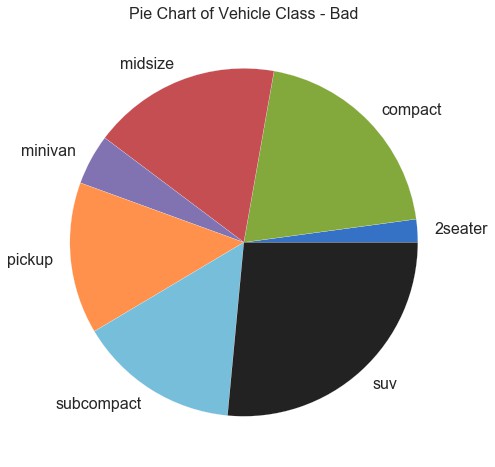
32. 餅圖 (Pie Chart)
餅圖是顯示組成的經典方式。然而,現在通常不建議使用它,因為餡餅部分的面積有時會變得誤導。因此,如果您要使用餅圖,強烈建議明確記下餅圖每個部分的百分比或數字。
-
# Import -
df_raw = pd.read_csv("https://github.com/selva86/datasets/raw/master/mpg_ggplot2.csv") -
-
# Prepare Data -
df = df_raw.groupby('class').size() -
-
# Make the plot with pandas -
df.plot(kind='pie', subplots=True, figsize=(8, 8)) -
plt.title("Pie Chart of Vehicle Class - Bad") -
plt.ylabel("") -
plt.show()
▲圖32
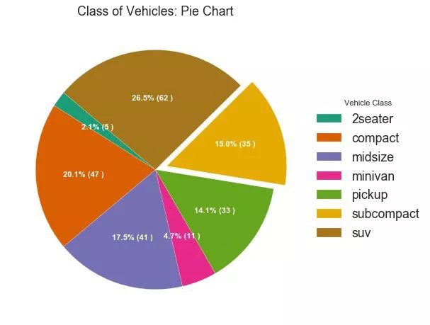
▲圖32-2
33. 樹形圖 (Treemap)
樹形圖類似於餅圖,它可以更好地完成工作而不會誤導每個組的貢獻。(註:需要安裝 squarify 庫)
-
# pip install squarify -
import squarify -
-
# Import Data -
df_raw = pd.read_csv("https://github.com/selva86/datasets/raw/master/mpg_ggplot2.csv") -
-
# Prepare Data -
df = df_raw.groupby('class').size().reset_index(name='counts') -
labels = df.apply(lambda x: str(x[0]) + "\n (" + str(x[1]) + ")", axis=1) -
sizes = df['counts'].values.tolist() -
colors = [plt.cm.Spectral(i/float(len(labels))) for i in range(len(labels))] -
-
# Draw Plot -
plt.figure(figsize=(12,8), dpi= 80) -
squarify.plot(sizes=sizes, label=labels, color=colors, alpha=.8) -
-
# Decorate -
plt.title('Treemap of Vechile Class') -
plt.axis('off') -
plt.show()

▲圖33
34. 條形圖 (Bar Chart)
條形圖是基於計數或任何給定指標視覺化專案的經典方式。在下麵的圖表中,我為每個專案使用了不同的顏色,但您通常可能希望為所有專案選擇一種顏色,除非您按組對其進行著色。顏色名稱儲存在下麵程式碼中的all_colors中。您可以透過在 plt.plot()中設定顏色引數來更改條的顏色。
-
import random -
-
# Import Data -
df_raw = pd.read_csv("https://github.com/selva86/datasets/raw/master/mpg_ggplot2.csv") -
-
# Prepare Data -
df = df_raw.groupby('manufacturer').size().reset_index(name='counts') -
n = df['manufacturer'].unique().__len__()+1 -
all_colors = list(plt.cm.colors.cnames.keys()) -
random.seed(100) -
c = random.choices(all_colors, k=n) -
-
# Plot Bars -
plt.figure(figsize=(16,10), dpi= 80) -
plt.bar(df['manufacturer'], df['counts'], color=c, width=.5) -
for i, val in enumerate(df['counts'].values): -
plt.text(i, val, float(val), horizontalalignment='center', verticalalignment='bottom', fontdict={'fontweight':500, 'size':12}) -
-
# Decoration -
plt.gca().set_xticklabels(df['manufacturer'], rotation=60, horizontalalignment= 'right') -
plt.title("Number of Vehicles by Manaufacturers", fontsize=22) -
plt.ylabel('# Vehicles') -
plt.ylim(0, 45) -
plt.show()

▲圖34
06 變化 (Change)
35. 時間序列圖 (Time Series Plot)
時間序列圖用於顯示給定度量隨時間變化的方式。在這裡,您可以看到1949年至 1969年間航空客運量的變化情況。
-
# Import Data -
df = pd.read_csv('https://github.com/selva86/datasets/raw/master/AirPassengers.csv') -
-
# Draw Plot -
plt.figure(figsize=(16,10), dpi= 80) -
plt.plot('date', 'traffic', data=df, color='tab:red') -
-
# Decoration -
plt.ylim(50, 750) -
xtick_location = df.index.tolist()[::12] -
xtick_labels = [x[-4:] for x in df.date.tolist()[::12]] -
plt.xticks(ticks=xtick_location, labels=xtick_labels, rotation=0, fontsize=12, horizontalalignment='center', alpha=.7) -
plt.yticks(fontsize=12, alpha=.7) -
plt.title("Air Passengers Traffic (1949 - 1969)", fontsize=22) -
plt.grid(axis='both', alpha=.3) -
-
# Remove borders -
plt.gca().spines["top"].set_alpha(0.0) -
plt.gca().spines["bottom"].set_alpha(0.3) -
plt.gca().spines["right"].set_alpha(0.0) -
plt.gca().spines["left"].set_alpha(0.3) -
plt.show()

▲圖35
36. 帶波峰波谷標記的時序圖 (Time Series with Peaks and Troughs Annotated)
下麵的時間序列繪製了所有峰值和低谷,並註釋了所選特殊事件的發生。

▲圖36
37. 自相關和部分自相關圖 (Autocorrelation (ACF) and Partial Autocorrelation (PACF) Plot)
自相關圖(ACF圖)顯示時間序列與其自身滯後的相關性。每條垂直線(在自相關圖上)表示系列與滯後0之間的滯後之間的相關性。圖中的藍色陰影區域是顯著性水平。那些位於藍線之上的滯後是顯著的滯後。
那麼如何解讀呢?
對於空乘旅客,我們看到多達14個滯後跨越藍線,因此非常重要。這意味著,14年前的航空旅客交通量對今天的交通狀況有影響。
PACF在另一方面顯示了任何給定滯後(時間序列)與當前序列的自相關,但是刪除了滯後的貢獻。
-
from statsmodels.graphics.tsaplots import plot_acf, plot_pacf -
-
# Import Data -
df = pd.read_csv('https://github.com/selva86/datasets/raw/master/AirPassengers.csv') -
-
# Draw Plot -
fig, (ax1, ax2) = plt.subplots(1, 2,figsize=(16,6), dpi= 80) -
plot_acf(df.traffic.tolist(), ax=ax1, lags=50) -
plot_pacf(df.traffic.tolist(), ax=ax2, lags=20) -
-
# Decorate -
# lighten the borders -
ax1.spines["top"].set_alpha(.3); ax2.spines["top"].set_alpha(.3) -
ax1.spines["bottom"].set_alpha(.3); ax2.spines["bottom"].set_alpha(.3) -
ax1.spines["right"].set_alpha(.3); ax2.spines["right"].set_alpha(.3) -
ax1.spines["left"].set_alpha(.3); ax2.spines["left"].set_alpha(.3) -
-
# font size of tick labels -
ax1.tick_params(axis='both', labelsize=12) -
ax2.tick_params(axis='both', labelsize=12) -
plt.show()
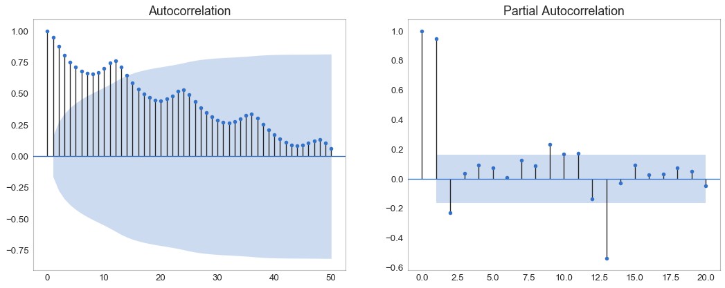
▲圖37
38. 交叉相關圖 (Cross Correlation plot)
交叉相關圖顯示了兩個時間序列相互之間的滯後。

▲圖38
39. 時間序列分解圖 (Time Series Decomposition Plot)
時間序列分解圖顯示時間序列分解為趨勢,季節和殘差分量。
-
from statsmodels.tsa.seasonal import seasonal_decompose -
from dateutil.parser import parse -
-
# Import Data -
df = pd.read_csv('https://github.com/selva86/datasets/raw/master/AirPassengers.csv') -
dates = pd.DatetimeIndex([parse(d).strftime('%Y-%m-01') for d in df['date']]) -
df.set_index(dates, inplace=True) -
-
# Decompose -
result = seasonal_decompose(df['traffic'], model='multiplicative') -
-
# Plot -
plt.rcParams.update({'figure.figsize': (10,10)}) -
result.plot().suptitle('Time Series Decomposition of Air Passengers') -
plt.show()

▲圖39
40. 多個時間序列 (Multiple Time Series)
您可以繪製多個時間序列,在同一圖表上測量相同的值,如下所示。
▲圖40
41. 使用輔助 Y 軸來繪製不同範圍的圖形 (Plotting with different scales using secondary Y axis)
如果要顯示在同一時間點測量兩個不同數量的兩個時間序列,則可以在右側的輔助Y軸上再繪製第二個系列。
▲圖41
42. 帶有誤差帶的時間序列 (Time Series with Error Bands)
如果您有一個時間序列資料集,每個時間點(日期/時間戳)有多個觀測值,則可以構建帶有誤差帶的時間序列。您可以在下麵看到一些基於每天不同時間訂單的示例。 另一個關於45天持續到達的訂單數量的例子。
在該方法中,訂單數量的平均值由白線表示。並且計算95%置信區間並圍繞均值繪製。

▲圖42

▲圖42-2
43. 堆積面積圖 (Stacked Area Chart)
堆積面積圖可以直觀地顯示多個時間序列的貢獻程度,因此很容易相互比較。

▲圖43
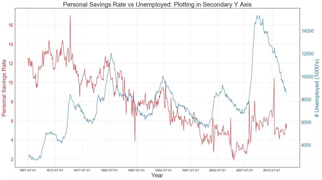
44. 未堆積的面積圖 (Area Chart UnStacked)
未堆積面積圖用於視覺化兩個或更多個系列相對於彼此的進度(起伏)。在下麵的圖表中,您可以清楚地看到隨著失業中位數持續時間的增加,個人儲蓄率會下降。未堆積面積圖表很好地展示了這種現象。
-
# Import Data -
df = pd.read_csv("https://github.com/selva86/datasets/raw/master/economics.csv") -
-
# Prepare Data -
x = df['date'].values.tolist() -
y1 = df['psavert'].values.tolist() -
y2 = df['uempmed'].values.tolist() -
mycolors = ['tab:red', 'tab:blue', 'tab:green', 'tab:orange', 'tab:brown', 'tab:grey', 'tab:pink', 'tab:olive'] -
columns = ['psavert', 'uempmed'] -
-
# Draw Plot -
fig, ax = plt.subplots(1, 1, figsize=(16,9), dpi= 80) -
ax.fill_between(x, y1=y1, y2=0, label=columns[1], alpha=0.5, color=mycolors[1], linewidth=2) -
ax.fill_between(x, y1=y2, y2=0, label=columns[0], alpha=0.5, color=mycolors[0], linewidth=2) -
-
# Decorations -
ax.set_title('Personal Savings Rate vs Median Duration of Unemployment', fontsize=18) -
ax.set(ylim=[0, 30]) -
ax.legend(loc='best', fontsize=12) -
plt.xticks(x[::50], fontsize=10, horizontalalignment='center') -
plt.yticks(np.arange(2.5, 30.0, 2.5), fontsize=10) -
plt.xlim(-10, x[-1]) -
-
# Draw Tick lines -
for y in np.arange(2.5, 30.0, 2.5): -
plt.hlines(y, xmin=0, xmax=len(x), colors='black', alpha=0.3, linestyles="--", lw=0.5) -
-
# Lighten borders -
plt.gca().spines["top"].set_alpha(0) -
plt.gca().spines["bottom"].set_alpha(.3) -
plt.gca().spines["right"].set_alpha(0) -
plt.gca().spines["left"].set_alpha(.3) -
plt.show()
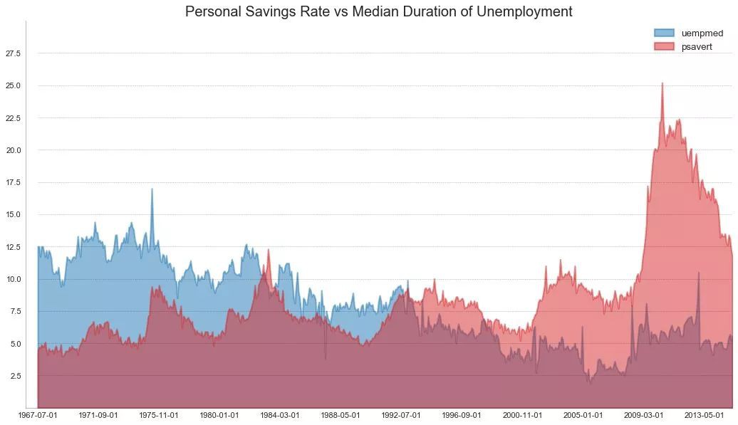
▲圖44
45. 日曆熱力圖 (Calendar Heat Map)
與時間序列相比,日曆地圖是視覺化基於時間的資料的備選和不太優選的選項。雖然可以在視覺上吸引人,但數值並不十分明顯。然而,它可以很好地描繪極端值和假日效果。(註:需要安裝 calmap 庫)
-
import matplotlib as mpl -
-
# pip install calmap -
# Python資料之道 備註 -
import calmap -
-
# Import Data -
df = pd.read_csv("https://raw.githubusercontent.com/selva86/datasets/master/yahoo.csv", parse_dates=['date']) -
df.set_index('date', inplace=True) -
-
# Plot -
plt.figure(figsize=(16,10), dpi= 80) -
calmap.calendarplot(df['2014']['VIX.Close'], fig_kws={'figsize': (16,10)}, yearlabel_kws={'color':'black', 'fontsize':14}, subplot_kws={'title':'Yahoo Stock Prices'}) -
plt.show()

▲圖45
46. 季節圖 (Seasonal Plot)
季節圖可用於比較上一季中同一天(年/月/周等)的時間序列。

▲圖46
07 分組 (Groups)
47. 樹狀圖 (Dendrogram)
樹形圖基於給定的距離度量將相似的點組合在一起,並基於點的相似性將它們組織在樹狀連結中。
-
import scipy.cluster.hierarchy as shc -
-
# Import Data -
df = pd.read_csv('https://raw.githubusercontent.com/selva86/datasets/master/USArrests.csv') -
-
# Plot -
plt.figure(figsize=(16, 10), dpi= 80) -
plt.title("USArrests Dendograms", fontsize=22) -
dend = shc.dendrogram(shc.linkage(df[['Murder', 'Assault', 'UrbanPop', 'Rape']], method='ward'), labels=df.State.values, color_threshold=100) -
plt.xticks(fontsize=12) -
plt.show()

▲圖47
48. 簇狀圖 (Cluster Plot)
簇狀圖(Cluster Plot)可用於劃分屬於同一群集的點。下麵是根據USArrests資料集將美國各州分為5組的代表性示例。此圖使用“謀殺”和“攻擊”列作為X和Y軸。或者,您可以將第一個到主要元件用作X軸和Y軸。
-
from sklearn.cluster import AgglomerativeClustering -
from scipy.spatial import ConvexHull -
-
# Import Data -
df = pd.read_csv('https://raw.githubusercontent.com/selva86/datasets/master/USArrests.csv') -
-
# Agglomerative Clustering -
cluster = AgglomerativeClustering(n_clusters=5, affinity='euclidean', linkage='ward') -
cluster.fit_predict(df[['Murder', 'Assault', 'UrbanPop', 'Rape']]) -
-
# Plot -
plt.figure(figsize=(14, 10), dpi= 80) -
plt.scatter(df.iloc[:,0], df.iloc[:,1], c=cluster.labels_, cmap='tab10') -
-
# Encircle -
def encircle(x,y, ax=None, **kw): -
if not ax: ax=plt.gca() -
p = np.c_[x,y] -
hull = ConvexHull(p) -
poly = plt.Polygon(p[hull.vertices,:], **kw) -
ax.add_patch(poly) -
-
# Draw polygon surrounding vertices -
encircle(df.loc[cluster.labels_ == 0, 'Murder'], df.loc[cluster.labels_ == 0, 'Assault'], ec="k", fc="gold", alpha=0.2, linewidth=0) -
encircle(df.loc[cluster.labels_ == 1, 'Murder'], df.loc[cluster.labels_ == 1, 'Assault'], ec="k", fc="tab:blue", alpha=0.2, linewidth=0) -
encircle(df.loc[cluster.labels_ == 2, 'Murder'], df.loc[cluster.labels_ == 2, 'Assault'], ec="k", fc="tab:red", alpha=0.2, linewidth=0) -
encircle(df.loc[cluster.labels_ == 3, 'Murder'], df.loc[cluster.labels_ == 3, 'Assault'], ec="k", fc="tab:green", alpha=0.2, linewidth=0) -
encircle(df.loc[cluster.labels_ == 4, 'Murder'], df.loc[cluster.labels_ == 4, 'Assault'], ec="k", fc="tab:orange", alpha=0.2, linewidth=0) -
-
# Decorations -
plt.xlabel('Murder'); plt.xticks(fontsize=12) -
plt.ylabel('Assault'); plt.yticks(fontsize=12) -
plt.title('Agglomerative Clustering of USArrests (5 Groups)', fontsize=22) -
plt.show()

▲圖48
49. 安德魯斯曲線 (Andrews Curve)
安德魯斯曲線有助於視覺化是否存在基於給定分組的數字特徵的固有分組。如果要素(資料集中的列)無法區分組(cyl),那麼這些線將不會很好地隔離,如下所示。
-
from pandas.plotting import andrews_curves -
-
# Import -
df = pd.read_csv("https://github.com/selva86/datasets/raw/master/mtcars.csv") -
df.drop(['cars', 'carname'], axis=1, inplace=True) -
-
# Plot -
plt.figure(figsize=(12,9), dpi= 80) -
andrews_curves(df, 'cyl', colormap='Set1') -
-
# Lighten borders -
plt.gca().spines["top"].set_alpha(0) -
plt.gca().spines["bottom"].set_alpha(.3) -
plt.gca().spines["right"].set_alpha(0) -
plt.gca().spines["left"].set_alpha(.3) -
-
plt.title('Andrews Curves of mtcars', fontsize=22) -
plt.xlim(-3,3) -
plt.grid(alpha=0.3) -
plt.xticks(fontsize=12) -
plt.yticks(fontsize=12) -
plt.show()
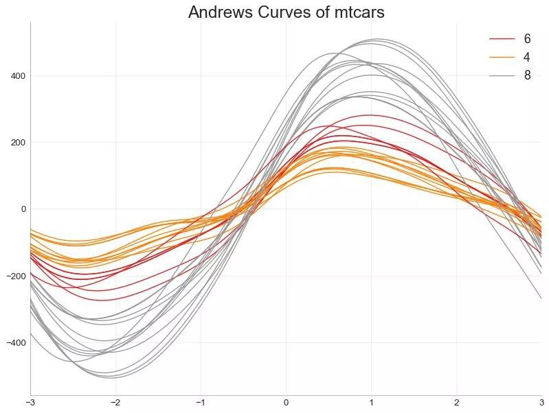
▲圖49
50. 平行坐標 (Parallel Coordinates)
平行坐標有助於視覺化特徵是否有助於有效地隔離組。如果實現隔離,則該特徵可能在預測該組時非常有用。
-
from pandas.plotting import parallel_coordinates -
-
# Import Data -
df_final = pd.read_csv("https://raw.githubusercontent.com/selva86/datasets/master/diamonds_filter.csv") -
-
# Plot -
plt.figure(figsize=(12,9), dpi= 80) -
parallel_coordinates(df_final, 'cut', colormap='Dark2') -
-
# Lighten borders -
plt.gca().spines["top"].set_alpha(0) -
plt.gca().spines["bottom"].set_alpha(.3) -
plt.gca().spines["right"].set_alpha(0) -
plt.gca().spines["left"].set_alpha(.3) -
-
plt.title('Parallel Coordinated of Diamonds', fontsize=22) -
plt.grid(alpha=0.3) -
plt.xticks(fontsize=12) -
plt.yticks(fontsize=12) -
plt.show()
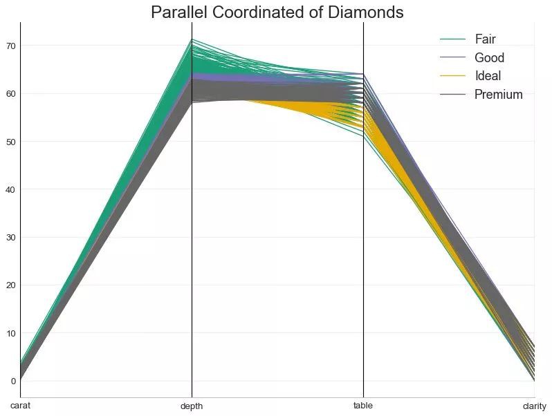
▲圖50
Tips:
(1)本文原文部分程式碼有不準確的地方,已進行修改;
(2)執行本文程式碼,除了安裝 matplotlib 和 seaborn 視覺化庫外,還需要安裝其他的一些輔助視覺化庫,已在程式碼部分作標註,具體內容請檢視下麵文章內容;
(3)由於微信文章總字數不能超過5萬字,刪除了部分程式碼,完整的文章請見:
http://liyangbit.com/pythonvisualization/matplotlib-top-50-visualizations/
原文:
Top 50 matplotlib Visualizations – The Master Plots (with full python code)
https://www.machinelearningplus.com/plots/top-50-matplotlib-visualizations-the-master-plots-python/
