

資料視覺化
在Linux系統中安裝matplotlib
Ubuntu17.10內建Python2版本和Python3版本,可以採用下麵的方式安裝Matplotlib。
$sudo apt-get install python3-matplotlib
如果你使用的是Python 2.7,執行如下命令:
$ sudo apt-get install python-matplotlib
如果你安裝了pip 就可以使用下麵的方式安裝:
$ pip install matplotlib
如果你的安裝比較慢,可以嘗試這種方式來安裝:
$ pip3 install matplotlib -i https://pypi.tuna.tsinghua.edu.cn/simple
常用的國內源地址有:
阿裡雲 http://mirrors.aliyun.com/pypi/simple/
豆瓣(douban) http://pypi.douban.com/simple/
清華大學 https://pypi.tuna.tsinghua.edu.cn/simple/
中國科學技術大學 http://pypi.mirrors.ustc.edu.cn/simple/
測試matplotlib
#如何沒有問題就是安裝成功了
>>>import matplotlib
>>>
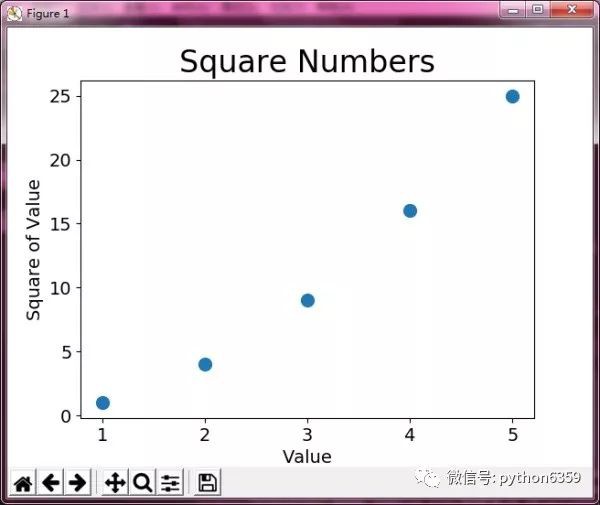
繪製簡單的折線圖
下麵來使用 matplotlib 繪製一個簡單的折線圖,再對其進行定製,以實現資訊更豐富的資料視覺化。我們將使用平方數序列 1 、 4 、 9 、 16 和 25 來繪製折線圖。
import matplotlib.pyplot as plt
squares = [1, 4, 9, 16, 25]
plt.plot(squares)
plt.show()
plt.show() # 開啟 matplotlib 檢視器,並顯示繪製的圖形。

修改標簽文字和線條粗細
圖形表明數字是越來越大的,但標簽文字太小,線條太細。所幸 matplotlib 讓你能夠調整視覺化的各個方面。
import matplotlib.pyplot as plt
squares = [1, 4, 9, 16, 25]
plt.plot(squares, linewidth=5)
# 設定圖表標題,並給坐標軸加上標簽
plt.title("Square Numbers", fontsize=24)
plt.xlabel("Value", fontsize=14)
plt.ylabel("Square of Value", fontsize=14)
# 設定刻度標記的大小
plt.tick_params(axis='both', labelsize=14)
plt.show()

校正圖形
圖形更容易閱讀後,我們發現沒有正確地繪製資料:折線圖的終點指出 4.0 的平方為 25 !下 面來修複這個問題。
import matplotlib.pyplot as plt
input_values = [1, 2, 3, 4, 5]
squares = [1, 4, 9, 16, 25]
plt.plot(input_values, squares, linewidth=5)
# 設定圖表標題,並給坐標軸加上標簽
plt.title("Square Numbers", fontsize=24)
plt.xlabel("Value", fontsize=14)
plt.ylabel("Square of Value", fontsize=14)
# 設定刻度標記的大小
plt.tick_params(axis='both', labelsize=14)
plt.show()

使用scatter()繪製散點圖並設定其樣式
有時候,需要繪製散點圖並設定各個資料點的樣式。要繪製單個點,可使用函式 scatter() ,並向它傳遞一對 x 和 y 坐標,它將在指定位置繪製一 個點:
import matplotlib.pyplot as plt
plt.scatter(2, 4)
plt.show()

下麵來設定輸出的樣式,使其更有趣:新增標題,給軸加上標簽,並確保所有文字都大到能夠看清:
import matplotlib.pyplot as plt
plt.scatter(2, 4, s=200)
# 設定圖表標題並給坐標軸加上標簽
plt.title("Square Numbers", fontsize=24)
plt.xlabel("Value", fontsize=14)
plt.ylabel("Square of Value", fontsize=14)
# 設定刻度標記的大小
plt.tick_params(axis='both', labelsize=14)
plt.show()

使用scatter()繪製一系列點
要繪製一系列的點,可向 scatter() 傳遞兩個分別包含 x 值和 y 值的串列,如下所示:
import matplotlib.pyplot as plt
x_values = [1, 2, 3, 4, 5]
y_values = [1, 4, 9, 16, 25]
plt.scatter(x_values, y_values, s=100)
# 設定圖表標題並給坐標軸加上標簽
plt.title("Square Numbers", fontsize=24)
plt.xlabel("Value", fontsize=14)
plt.ylabel("Square of Value", fontsize=14)
# 設定刻度標記的大小
plt.tick_params(axis='both', which='major', labelsize=14)
plt.show()
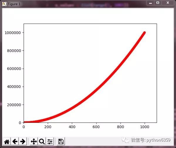
自動計算資料
手工計算串列要包含的值可能效率低下,需要繪製的點很多時尤其如此。
import matplotlib.pyplot as plt
x_values = list(range(1, 1001))
y_values = [x**2 for x in x_values]
plt.scatter(x_values, y_values, s=40)
# 設定每個坐標軸的取值範圍
plt.axis([0, 1100, 0, 1100000])
plt.show()

matplotlib允許你給散點圖中的各個點指定顏色。
預設為藍色點和黑色輪廓,在散點圖包含的資料點不多時效果很好。
但繪製很多點時,黑色輪廓可能會粘連在一起。
要刪除資料點的輪廓,可在呼叫scatter()時傳遞引數edgecolor='none':
自定義顏色
要修改資料點的顏色,可向scatter()傳遞引數c,並將其設定為要使用的顏色的名稱,如下所示:
plt.scatter(x_values, y_values, c='red', edgecolor='none', s=40)
 你還可以使用RGB顏色樣式自定義顏色。
plt.scatter(x_values, y_values, c=(0, 0, 0.8), edgecolor='none', s=40)

(0, 0, 0.8) 它們分別表示紅色、綠色和藍色分量。值越接近0,指定的顏色越深,值越接近1,指定的顏色越淺。
使用顏色對映
顏色對映(colormap)是一系列顏色,它們從起始顏色漸變到結束顏色。在視覺化中,顏色對映用於突出資料的規律,例如,你可能用較淺的顏色來顯示較小的值,並使用較深的顏色來顯示較大的值。
import matplotlib.pyplot as plt
x_values = list(range(1001))
y_values = [x**2 for x in x_values]
plt.scatter(x_values, y_values, c=y_values, cmap=plt.cm.Blues, edgecolor='none', s=40)

這些程式碼將y值較小的點顯示為淺藍色,並將y值較大的點顯示為深藍色。
自動儲存圖表
plt.savefig('squares_plot.png', bbox_inches='tight')
繪製隨機漫步圖
下麵的程式碼將隨機漫步的所有點都繪製出來:
import matplotlib.pyplot as plt
from random_walk import RandomWalk
# 建立一個RandomWalk實體,並將其包含的點都繪製出來
rw = RandomWalk()
rw.fill_walk()
plt.scatter(rw.x_values, rw.y_values, s=15)
plt.show()

參考文獻:《Python程式設計:從入門到實戰》
