
作者:zone
來源:zone7(ID:zone7py)
資料視覺化的庫有挺多的,這裡推薦幾個比較常用的:
-
Matplotlib
-
Plotly
-
Seaborn
-
Ggplot
-
Bokeh
-
Pyechart
-
Pygal
01 Plotly
plotly 檔案地址:
https://plot.ly/python/#financial-charts
使用方式:
plotly 有 online 和 offline 兩種方式,這裡只介紹 offline 的。
這是 plotly 官方教程的一部分:
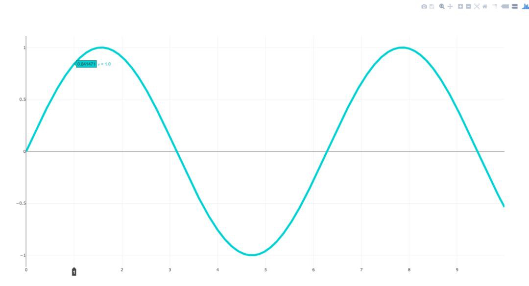
import plotly.plotly as py
import numpy as np
data = [dict(
visible=False,
line=dict(color=‘#00CED1’, width=6), # 配置線寬和顏色
name=‘? = ‘ + str(step),
x=np.arange(0, 10, 0.01), # x 軸引數
y=np.sin(step * np.arange(0, 10, 0.01))) for step in np.arange(0, 5, 0.1)] # y 軸引數
data[10][‘visible’] = True
py.iplot(data, filename=‘Single Sine Wave’)
只要將最後一行中的
py.iplot
替換為下麵程式碼
py.offline.plot
便可以執行。
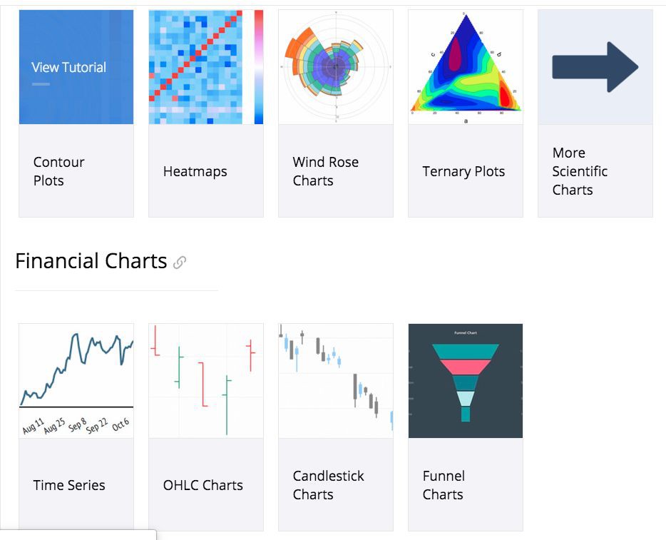
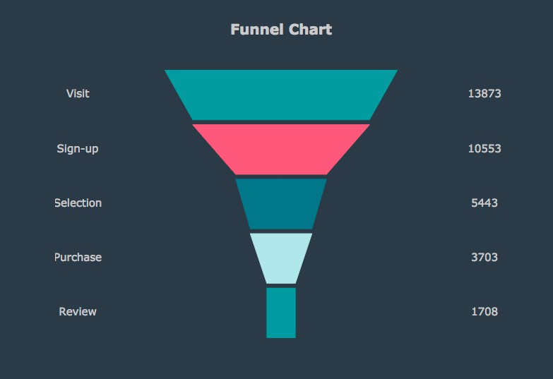
1. 漏斗圖
這個圖程式碼太長了,就不 po 出來了。
2. Basic Box Plot
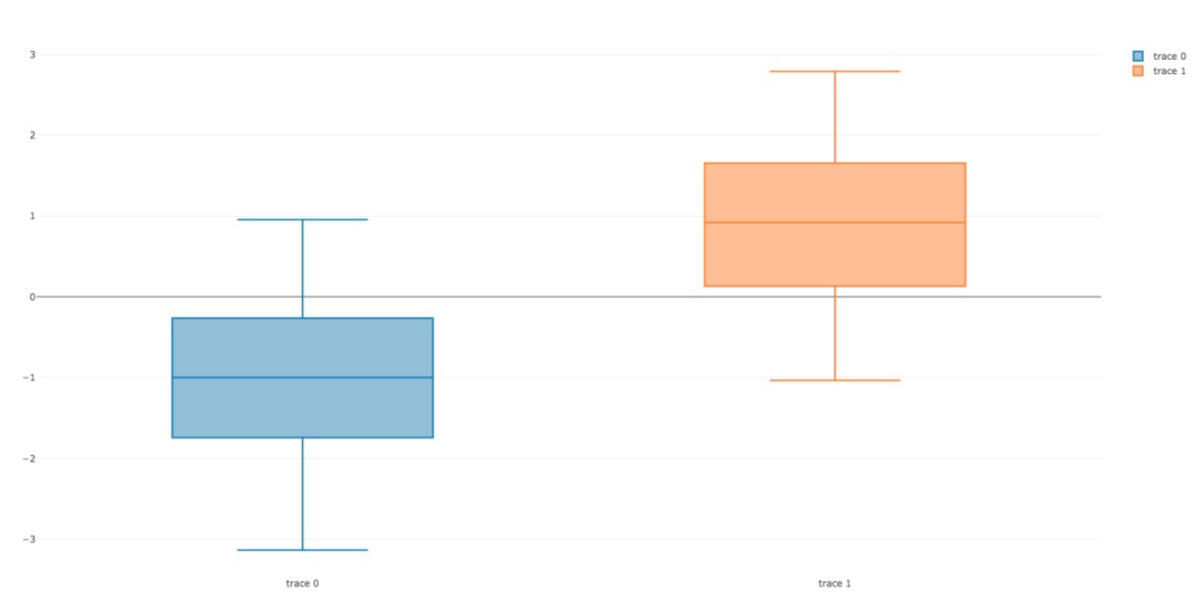
import plotly.plotly
import plotly.graph_objs as go
import numpy as np
y0 = np.random.randn(50)-1
y1 = np.random.randn(50)+1

trace0 = go.Box(
    y=y0
)
trace1 = go.Box(
    y=y1
)
data = [trace0, trace1]
plotly.offline.plot(data)
3. Wind Rose Chart
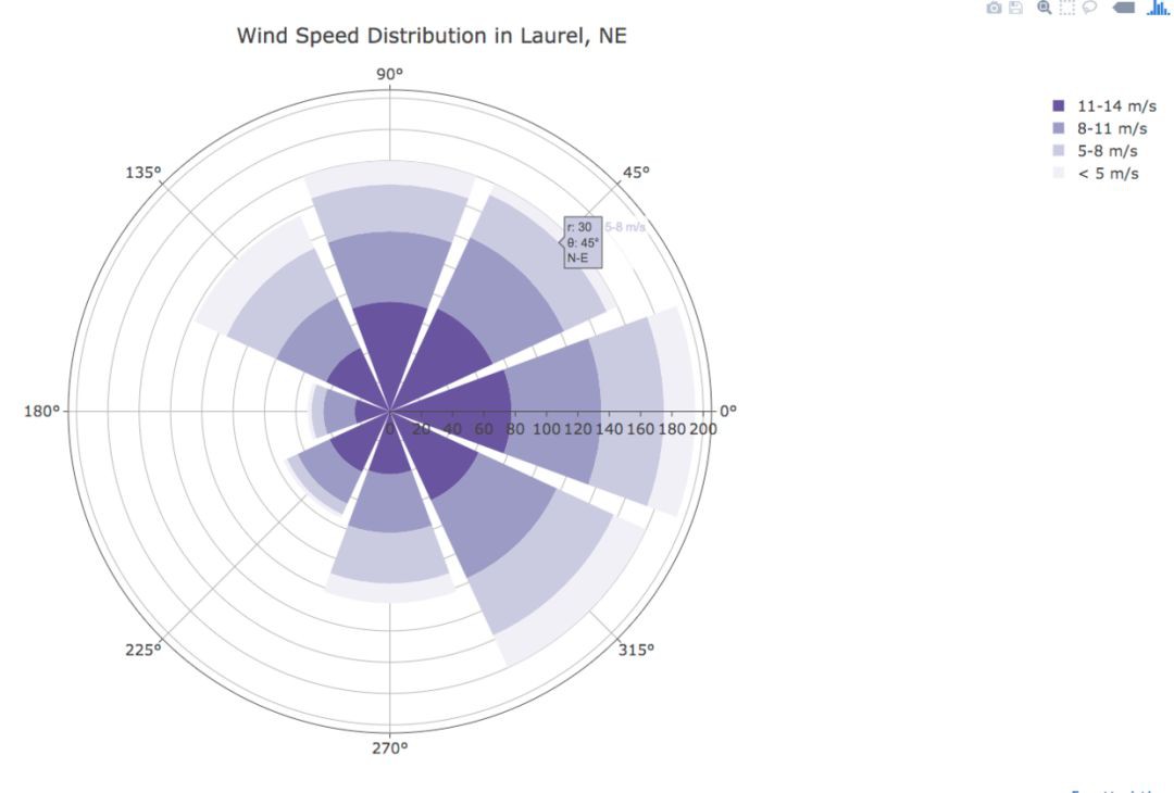
import plotly.graph_objs as go
trace1 = go.Barpolar(
r=[77.5, 72.5, 70.0, 45.0, 22.5, 42.5, 40.0, 62.5],
text=['North', 'N-E', 'East', 'S-E', 'South', 'S-W', 'West', 'N-W'],
name='11-14 m/s',
marker=dict(
color='rgb(106,81,163)'
)
)
trace2 = go.Barpolar(
r=[57.49999999999999, 50.0, 45.0, 35.0, 20.0, 22.5, 37.5, 55.00000000000001],
text=['North', 'N-E', 'East', 'S-E', 'South', 'S-W', 'West', 'N-W'], # 滑鼠浮動標簽文字描述
name='8-11 m/s',
marker=dict(
color='rgb(158,154,200)'
)
)
trace3 = go.Barpolar(
r=[40.0, 30.0, 30.0, 35.0, 7.5, 7.5, 32.5, 40.0],
text=['North', 'N-E', 'East', 'S-E', 'South', 'S-W', 'West', 'N-W'],
name='5-8 m/s',
marker=dict(
color='rgb(203,201,226)'
)
)
trace4 = go.Barpolar(
r=[20.0, 7.5, 15.0, 22.5, 2.5, 2.5, 12.5, 22.5],
text=['North', 'N-E', 'East', 'S-E', 'South', 'S-W', 'West', 'N-W'],
name=',
marker=dict(
color='rgb(242,240,247)'
)
)
data = [trace1, trace2, trace3, trace4]
layout = go.Layout(
title='Wind Speed Distribution in Laurel, NE',
font=dict(
size=16
),
legend=dict(
font=dict(
size=16
)
),
radialaxis=dict(
ticksuffix='%'
),
orientation=270
)
fig = go.Figure(data=data, layout=layout)
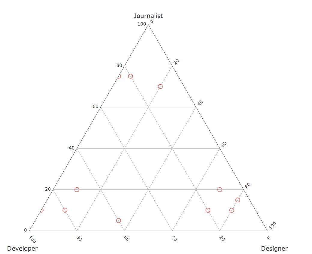
plotly.offline.plot(fig, filename='polar-area-chart')4. Basic Ternary Plot with Markers
篇幅有點長,這裡就不 po 程式碼了。
02 Bokeh
這裡展示一下常用的圖表和比較搶眼的圖表,詳細的檔案可檢視:
https://bokeh.pydata.org/en/latest/docs/user_guide/categorical.html
1. 條形圖
這配色看著還挺舒服的,比 pyecharts 條形圖的配色好看一點。

from bokeh.io import show, output_file
from bokeh.models import ColumnDataSource
from bokeh.palettes import Spectral6
from bokeh.plotting import figure
output_file("colormapped_bars.html")#  配置輸出檔案名
fruits = ['Apples', '魅族', 'OPPO', 'VIVO', '小米', '華為'] # 資料
counts = [5, 3, 4, 2, 4, 6] # 資料
source = ColumnDataSource(data=dict(fruits=fruits, counts=counts, color=Spectral6))
p = figure(x_range=fruits, y_range=(0,9), plot_height=250, title="Fruit Counts",
           toolbar_location=None, tools="")# 條形圖配置項
p.vbar(x='fruits', top='counts', width=0.9, color='color', legend="fruits", source=source)
p.xgrid.grid_line_color = None # 配置網格線顏色
p.legend.orientation = "horizontal" # 圖表方向為水平方向
p.legend.location = "top_center"
show(p) # 展示圖表
2. 年度條形圖
可以對比不同時間點的量。

from bokeh.io import show, output_file
from bokeh.models import ColumnDataSource, FactorRange
from bokeh.plotting import figure
output_file("bars.html") # 輸出檔案名
fruits = ['Apple', '魅族', 'OPPO', 'VIVO', '小米', '華為'] # 引數
years = ['2015', '2016', '2017'] # 引數
data = {'fruits': fruits,
        '2015': [2, 1, 4, 3, 2, 4],
        '2016': [5, 3, 3, 2, 4, 6],
        '2017': [3, 2, 4, 4, 5, 3]}
x = [(fruit, year) for fruit in fruits for year in years]
counts = sum(zip(data['2015'], data['2016'], data['2017']), ())
source = ColumnDataSource(data=dict(x=x, counts=counts))
p = figure(x_range=FactorRange(*x), plot_height=250, title="Fruit Counts by Year",
           toolbar_location=None, tools="")
p.vbar(x='x', top='counts', width=0.9, source=source)
p.y_range.start = 0
p.x_range.range_padding = 0.1
p.xaxis.major_label_orientation = 1
p.xgrid.grid_line_color = None
show(p)
3. 餅圖

from collections import Counter
from math import pi
import pandas as pd
from bokeh.io import output_file, show
from bokeh.palettes import Category20c
from bokeh.plotting import figure
from bokeh.transform import cumsum
output_file("pie.html")
x = Counter({
    '中國': 157,
    '美國': 93,
    '日本': 89,
    '巴西': 63,
    '德國': 44,
    '印度': 42,
    '義大利': 40,
    '澳大利亞': 35,
    '法國': 31,
    '西班牙': 29
})
data = pd.DataFrame.from_dict(dict(x), orient='index').reset_index().rename(index=str, columns={0:'value', 'index':'country'})
data['angle'] = data['value']/sum(x.values()) * 2*pi
data['color'] = Category20c[len(x)]
p = figure(plot_height=350, title="Pie Chart", toolbar_location=None,
           tools="hover", tooltips="@country: @value")
p.wedge(x=0, y=1, radius=0.4,
        start_angle=cumsum('angle', include_zero=True), end_angle=cumsum('angle'),
        line_color="white", fill_color='color', legend='country', source=data)
p.axis.axis_label=None
p.axis.visible=False
p.grid.grid_line_color = None
show(p)
4. 條形圖

from bokeh.io import output_file, show
from bokeh.models import ColumnDataSource
from bokeh.palettes import GnBu3, OrRd3
from bokeh.plotting import figure
output_file("stacked_split.html")
fruits = ['Apples', 'Pears', 'Nectarines', 'Plums', 'Grapes', 'Strawberries']
years = ["2015", "2016", "2017"]
exports = {'fruits': fruits,
           '2015': [2, 1, 4, 3, 2, 4],
           '2016': [5, 3, 4, 2, 4, 6],
           '2017': [3, 2, 4, 4, 5, 3]}
imports = {'fruits': fruits,
           '2015': [-1, 0, -1, -3, -2, -1],
           '2016': [-2, -1, -3, -1, -2, -2],
           '2017': [-1, -2, -1, 0, -2, -2]}
p = figure(y_range=fruits, plot_height=250, x_range=(-16, 16), title="Fruit import/export, by year",
           toolbar_location=None)
p.hbar_stack(years, y='fruits', height=0.9, color=GnBu3, source=ColumnDataSource(exports),
             legend=["%s exports" % x for x in years])
p.hbar_stack(years, y='fruits', height=0.9, color=OrRd3, source=ColumnDataSource(imports),
             legend=["%s imports" % x for x in years])
p.y_range.range_padding = 0.1
p.ygrid.grid_line_color = None
p.legend.location = "top_left"
p.axis.minor_tick_line_color = None
p.outline_line_color = None
show(p)
5. 散點圖

from bokeh.plotting import figure, output_file, show
output_file("line.html")
p = figure(plot_width=400, plot_height=400)
p.circle([1, 2, 3, 4, 5], [6, 7, 2, 4, 5], size=20, color="navy", alpha=0.5)
show(p)
6. 六邊形圖

import numpy as np
from bokeh.io import output_file, show
from bokeh.plotting import figure
from bokeh.util.hex import axial_to_cartesian
output_file("hex_coords.html")
q = np.array([0, 0, 0, -1, -1, 1, 1])
r = np.array([0, -1, 1, 0, 1, -1, 0])
p = figure(plot_width=400, plot_height=400, toolbar_location=None) #
p.grid.visible = False # 配置網格是否可見
p.hex_tile(q, r, size=1, fill_color=["firebrick"] * 3 + ["navy"] * 4,
           line_color="white", alpha=0.5)
x, y = axial_to_cartesian(q, r, 1, "pointytop")
p.text(x, y, text=["(%d, %d)" % (q, r) for (q, r) in zip(q, r)],
       text_baseline="middle", text_align="center")
show(p)
7. 環比條形圖
這個實現挺厲害的,看了一眼就吸引了我。我在程式碼中都做了一些註釋,希望對你理解有幫助。註:圓心為正中央,即直角坐標系中標簽為(0,0)的地方。

from collections import OrderedDict
from math import log, sqrt
import numpy as np
import pandas as pd
from six.moves import cStringIO as StringIO
from bokeh.plotting import figure, show, output_file

antibiotics = """
bacteria,                        penicillin, streptomycin, neomycin, gram
結核分枝桿菌,                      800,        5,            2,        negative
沙門氏菌,                         10,         0.8,          0.09,     negative
變形桿菌,                         3,          0.1,          0.1,      negative
肺炎克雷伯氏菌,                    850,        1.2,          1,        negative
布魯氏菌,                         1,          2,            0.02,     negative
銅綠假單胞菌,                     850,        2,            0.4,      negative
大腸桿菌,                        100,        0.4,          0.1,      negative
產氣桿菌,                         870,        1,            1.6,      negative
白色葡萄球菌,                     0.007,      0.1,          0.001,    positive
溶血性鏈球菌,                     0.001,      14,           10,       positive
草綠色鏈球菌,                     0.005,      10,           40,       positive
肺炎雙球菌,                       0.005,      11,           10,       positive
"""

drug_color = OrderedDict([# 配置中間標簽名稱與顏色
    ("盤尼西林", "#0d3362"),
    ("鏈黴素", "#c64737"),
    ("新黴素", "black"),
])
gram_color = {
    "positive": "#aeaeb8",
    "negative": "#e69584",
}
# 讀取資料
df = pd.read_csv(StringIO(antibiotics),
                 skiprows=1,
                 skipinitialspace=True,
                 engine='python')
width = 800
height = 800
inner_radius = 90
outer_radius = 300 - 10

minr = sqrt(log(.001 * 1E4))
maxr = sqrt(log(1000 * 1E4))
a = (outer_radius - inner_radius) / (minr - maxr)
b = inner_radius - a * maxr


def rad(mic):
    return a * np.sqrt(np.log(mic * 1E4)) + b
big_angle = 2.0 * np.pi / (len(df) + 1)
small_angle = big_angle / 7
# 整體配置
p = figure(plot_width=width, plot_height=height, title="",
           x_axis_type=None, y_axis_type=None,
           x_range=(-420, 420), y_range=(-420, 420),
           min_border=0, outline_line_color="black",
           background_fill_color="#f0e1d2")
p.xgrid.grid_line_color = None
p.ygrid.grid_line_color = None
# annular wedges
angles = np.pi / 2 - big_angle / 2 - df.index.to_series() * big_angle  #計算角度
colors = [gram_color[gram] for gram in df.gram] # 配置顏色
p.annular_wedge(
    0, 0, inner_radius, outer_radius, -big_angle + angles, angles, color=colors,
)

# small wedges
p.annular_wedge(0, 0, inner_radius, rad(df.penicillin),
                -big_angle + angles + 5 * small_angle, -big_angle + angles + 6 * small_angle,
                color=drug_color['盤尼西林'])
p.annular_wedge(0, 0, inner_radius, rad(df.streptomycin),
                -big_angle + angles + 3 * small_angle, -big_angle + angles + 4 * small_angle,
                color=drug_color['鏈黴素'])
p.annular_wedge(0, 0, inner_radius, rad(df.neomycin),
                -big_angle + angles + 1 * small_angle, -big_angle + angles + 2 * small_angle,
                color=drug_color['新黴素'])
# 繪製大圓和標簽
labels = np.power(10.0, np.arange(-3, 4))
radii = a * np.sqrt(np.log(labels * 1E4)) + b
p.circle(0, 0, radius=radii, fill_color=None, line_color="white")
p.text(0, radii[:-1], [str(r) for r in labels[:-1]],
       text_font_size="8pt", text_align="center", text_baseline="middle")
# 半徑
p.annular_wedge(0, 0, inner_radius - 10, outer_radius + 10,
                -big_angle + angles, -big_angle + angles, color="black")
# 細菌標簽
xr = radii[0] * np.cos(np.array(-big_angle / 2 + angles))
yr = radii[0] * np.sin(np.array(-big_angle / 2 + angles))
label_angle = np.array(-big_angle / 2 + angles)
label_angle[label_angle # easier to read labels on the left side
# 繪製各個細菌的名字
p.text(xr, yr, df.bacteria, angle=label_angle,
       text_font_size="9pt", text_align="center", text_baseline="middle")
# 繪製圓形,其中數字分別為 x 軸與 y 軸標簽
p.circle([-40, -40], [-370, -390], color=list(gram_color.values()), radius=5)
# 繪製文字
p.text([-30, -30], [-370, -390], text=["Gram-" + gr for gr in gram_color.keys()],
       text_font_size="7pt", text_align="left", text_baseline="middle")
# 繪製矩形,中間標簽部分。其中 -40,-40,-40 為三個矩形的 x 軸坐標。18,0,-18 為三個矩形的 y 軸坐標
p.rect([-40, -40, -40], [18, 0, -18], width=30, height=13,
       color=list(drug_color.values()))
# 配置中間標簽文字、文字大小、文字對齊方式
p.text([-15, -15, -15], [18, 0, -18], text=list(drug_color),
       text_font_size="9pt", text_align="left", text_baseline="middle")
output_file("burtin.html", title="burtin.py example")
show(p)
8. 元素週期表
元素週期表,這個實現好牛逼啊,距離初三剛開始學化學已經很遙遠了,想當年我還是化學課代表呢!由於基本用不到化學了,這裡就不實現了。


03 Pyecharts
pyecharts 也是一個比較常用的資料視覺化庫,用得也是比較多的了,是百度 echarts 庫的 python 支援。這裡也展示一下常用的圖表。
檔案地址為:
http://pyecharts.org/#/zh-cn/prepare?id=%E5%AE%89%E8%A3%85-pyecharts
1. 條形圖

from pyecharts import Bar
bar = Bar("我的第一個圖表", "這裡是副標題")
bar.add("服裝", ["襯衫", "羊毛衫", "雪紡衫", "褲子", "高跟鞋", "襪子"], [5, 20, 36, 10, 75, 90])
# bar.print_echarts_options() # 該行只為了列印配置項,方便除錯時使用
bar.render()    # 生成本地 HTML 檔案
2. 散點圖

from pyecharts import Polar
import random
data_1 = [(10, random.randint(1, 100)) for i in range(300)]
data_2 = [(11, random.randint(1, 100)) for i in range(300)]
polar = Polar("極坐標系-散點圖示例", width=1200, height=600)
polar.add("", data_1, type='scatter')
polar.add("", data_2, type='scatter')
polar.render()
3. 餅圖

import random
from pyecharts import Pie
attr = ['A', 'B', 'C', 'D', 'E', 'F']
pie = Pie("餅圖示例", width=1000, height=600)
pie.add(
    "",
    attr,
    [random.randint(0, 100) for _ in range(6)],
    radius=[50, 55],
    center=[25, 50],
    is_random=True,
)
pie.add(
    "",
    attr,
    [random.randint(20, 100) for _ in range(6)],
    radius=[0, 45],
    center=[25, 50],
    rosetype="area",
)
pie.add(
    "",
    attr,
    [random.randint(0, 100) for _ in range(6)],
    radius=[50, 55],
    center=[65, 50],
    is_random=True,
)
pie.add(
    "",
    attr,
    [random.randint(20, 100) for _ in range(6)],
    radius=[0, 45],
    center=[65, 50],
    rosetype="radius",
)
pie.render()
4. 詞雲
這個是我在前面的文章中用到的圖片實體,這裡就不 po 具體資料了。

from pyecharts import WordCloud
name = ['Sam S Club'] # 詞條
value = [10000] # 權重
wordcloud = WordCloud(width=1300, height=620)
wordcloud.add("", name, value, word_size_range=[20, 100])
wordcloud.render()
5. 樹圖
這個是我在前面的文章中用到的圖片實體,這裡就不 po 具體資料了。

from pyecharts import TreeMap
data =   [ # 鍵值對資料結構
      {
          value: 1212,    # 數值
          # 子節點
          children: [
              {
                  # 子節點數值
                  value: 2323,
                  # 子節點名
                  name: 'description of this node',
                  children: [...],
              },
              {
                  value: 4545,
                  name: 'description of this node',
                  children: [
                      {
                          value: 5656,
                          name: 'description of this node',
                          children: [...]
                      },
                      ...
                  ]
              }
          ]
      },
      ...
  ]
treemap = TreeMap(title, width=1200, height=600) # 設定標題與寬高
treemap.add("深圳", data, is_label_show=True, label_pos='inside', label_text_size=19)
treemap.render()
6. 地圖

from pyecharts import Map

value = [155, 10, 66, 78, 33, 80, 190, 53, 49.6]
attr = [
    "福建", "山東", "北京", "上海", "甘肅", "新疆", "河南", "廣西", "西藏"
    ]
map = Map("Map 結合 VisualMap 示例", width=1200, height=600)
map.add(
    "",
    attr,
    value,
    maptype="china",
    is_visualmap=True,
    visual_text_color="#000",
)
map.render()
7. 3D 散點圖
from pyecharts import Scatter3D
import random
data = [
    [random.randint(0, 100),
    random.randint(0, 100),
    random.randint(0, 100)] for _ in range(80)
]
range_color = [
    '#313695', '#4575b4', '#74add1', '#abd9e9', '#e0f3f8', '#ffffbf',
    '#fee090', '#fdae61', '#f46d43', '#d73027', '#a50026']
scatter3D = Scatter3D("3D 散點圖示例", width=1200, height=600) # 配置寬高
scatter3D.add("", data, is_visualmap=True, visual_range_color=range_color)  # 設定顏色等
scatter3D.render() # 渲染
04 後記
大概介紹就是這樣了,三個庫的功能都挺強大的,bokeh 的中文資料會少一點,如果閱讀英文有點難度,還是建議使用 pyecharts 就好。總體也不是很難,按照檔案來修改資料都能夠直接上手使用。主要是多練習。

據統計,99%的大咖都完成了這個神操作
▼
更多精彩 在公眾號後臺對話方塊輸入以下關鍵詞 檢視更多優質內容! PPT | 報告 | 讀書 | 書單 Python | 機器學習 | 深度學習 | 神經網路 區塊鏈 | 揭秘 | 乾貨 | 數學
誰再問你“天天爬那些資料有什麼用”,就把這5本書扔給他!
Q: 你都常用哪些Python第三方庫?
歡迎留言與大家分享
覺得不錯,請把這篇文章分享給你的朋友
轉載 / 投稿請聯絡:baiyu@hzbook.com
更多精彩,請在後臺點選“歷史文章”檢視