 知識星球
知識星球作者:大搜車前端團隊部落格
網址:http://f2e.souche.com/blog/jie-du-cssbu-ju-zhi-shui-ping-chui-zhi-ju-zhong/
對一個元素水平垂直居中,在我們的工作中是會經常遇到的,也是CSS佈局中很重要的一部分,本文就來講講CSS水平垂直居中的一些方法。由於我們大搜車的日常工作中已經不再需要理會低版本IE,所以本文所貼出的方法,是沒有去考慮IE的,如果有相容需要,可以參見這篇文章:http://www.cnblogs.com/Dudy/p/4085292.html。另外,文中的css都是用less書寫的,如果看不懂less,可以把我給的demo連結開啟,然後在控制臺中檢視最終的css,或者是點選codepen上的“View Compiled”按鈕,可以檢視編譯後的css
先看一張圖,這是去年cssConf大會時阿裡的 @寒冬winter 老師放出來的:
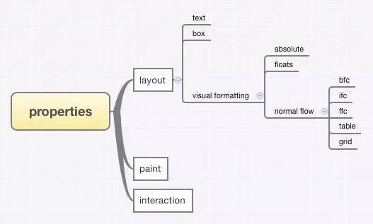
如圖所示,CSS佈局是可以分為幾大塊的:
- 盒子內部的佈局
- 文字的佈局
- 盒模型本身的佈局
- 盒子之間的佈局visual formatting
- 脫離正常流normal flow的盒子的佈局
- absolute佈局背景關係下的佈局
- float佈局背景關係下的佈局
- 正常流normal flow下的盒子的佈局
- BFC佈局背景關係下的佈局
- IFC佈局背景關係下的佈局
- FFC佈局背景關係下的佈局
- table佈局背景關係下的佈局
- css grid佈局背景關係下的佈局
所有的CSS佈局其實都是圍繞著這些佈局模組來的,水平垂直居中也一樣。
一. 文字的水平垂直居中
line-height + text-align:center
DEMO連結:http://codepen.io/Dudy/pen/aOKWWO?editors=110
水平垂直居中水平垂直居中
html,body{
margin: 0;
}
.wrap{
line-height: 400px;
text-align:center;
height: 400px;
font-size: 36px;
background-color: #ccc;
}
這種方法只適合單行文字的水平垂直居中
二. 利用盒模型的水平垂直居中
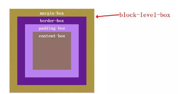
我們一般講的盒模型都是說的塊級盒的盒模型,也只有塊級盒的盒模型用得多一點,塊級盒block-level box又是分別由content-box、padding-box、border-box、margin-box組成的,如下圖:
也就說我任一個子盒子的水平和垂直方向的邊與最外面盒子的間距都是可以控制的,因此也就有如下居中方法:
padding填充
DEMO連結:http://codepen.io/Dudy/pen/EjRvgp?editors=110
程式碼:
@wrapWidth : 400px;
.wrap{
margin-left: auto;
margin-right: auto;
margin-top: 20px;
width: @wrapWidth;
height: @wrapWidth;
background-color: #ccc;
}
.content{
@contentWidth : 100px;
width: @contentWidth;
height: @contentWidth;
padding: (@wrapWidth – @contentWidth) / 2;
background-color: #333;
background-clip:content-box;
}
也可以用css3的calc()動態計算:
DEMO連結:http://codepen.io/Dudy/pen/RPJZVw?editors=110
.wrap{
margin-top: 20px;
margin-left: auto;
margin-right: auto;
width: 400px;
height: 400px;
background-color: #ccc;
.content{
padding: -webkit-calc(~”(100% – 100px) / 2″);
padding: calc(~”(100% – 100px) / 2″);
width: 100px;
height: 100px;
background-color: #333;
background-clip: content-box;
}
}
註意這裡我在calc中使用了一個~””的寫法,這是less中的一個語法,告訴less這裡不被less所編譯,要是被less編譯了的話,css的calc函式的引數就不是100% – 100px,而是0%了。
margin填充
DEMO連結:http://codepen.io/Dudy/pen/jPKxYL?editors=110
程式碼:
.wrap{
@wrapHeight : 400px;
@contenHeight : 100px;
overflow: hidden;
width: 100%;
height: @wrapHeight;
background-color: #ccc;
.ele{
margin-left: auto;
margin-right: auto;
margin-top: (@wrapHeight – @contenHeight) / 2;
width: 100px;
height: @contenHeight;
background-color: #333;
color: #fff;
}
}
使用margin填充我們需要知道元素的寬度,這點不太靈活,不過CSS3搞出了一個加fit-content的屬性值,可以動態計算元素的寬度,DEMO連結
使用盒模型進行佈局不會產生reflow,相容也好,使用盒模型佈局是一種佈局思想,其實僅僅靠它就能實現很多visual formatting才能實現的佈局,這是另一個話題,這裡不展開。
三. absolute佈局背景關係下的水平垂直居中
50% + -50%
原理很簡單,就是利用left:50%將盒子的左邊先置於父容器的中點,然後再將盒子往左偏移盒子自身寬度的50%,這裡有三種具體實現:
DEMO連結:http://codepen.io/Dudy/pen/VLdzRv?editors=110
水平垂直居中水平垂直
居中水平垂直居中水平
垂直居中水平垂直居
中水平垂直居中
居中水平垂直居中水平
垂直居中水平垂直居
中水平垂直居中
居中水平垂直居中水平
垂直居中水平垂直居
中水平垂直居中
.wrap{
position: relative;
width: 100%;
height: 200px;
border:1px solid;
background-color: #ccc;
.ele{
position: absolute;
left: 50%;
top: 50%;
background-color: #333;
&.margin{
width: 160px;
height: 100px;
margin-left: -80px;
margin-top: -50px;
}
&.translate{
-webkit-transform:translate3d(-50%, -50%, 0);
transform:translate3d(-50%, -50%, 0);
}
.ele-inner{
position: relative;
left: -50%;
top: -50%;
width: 100%;
height: 100%;
background-color: #333;
}
&.relative{
width: 150px;
height: 100px;
background-color: transparent;
}
}
}
上面三個方法中,margin方法和relative方法都需要知道元素的寬高才行(relative方法只知道高也行),適用於固定式佈局,而transform方法則可以不知道元素寬高
text-align:center + absolute
text-aign:center本來是不能直接作用於absolute元素的,但是沒有給其left等值的行級absolute元素是會受文字的影響的,可以參考張老師的這篇文章
DEMO連結:http://codepen.io/Dudy/pen/BNVwJx?editors=110
程式碼:
.wrap{
text-align: center;
width: 100%;
height: 400px;
background-color: #ccc;
font-size: 0;
}
.ele{
position: absolute;
margin-left: -(100px / 2);
margin-top: (400px – 100px) / 2;
width: 100px;
height: 100px;
display: inline-block;
background-color: #333;
}
簡單解釋下,首先,text-align:center作用的是文字而不是absolute的元素,但是,當absolute元素為inline- block的時候,它會受到文字的影響,然後你可能會問這裡沒文字啊,我只能告訴你說這下麵是有的,是個匿名的文字節點。具體的這裡不展開,可以參考標準,然後理解這句話:
If the inline box contains no glyphs at all, it is considered to contain a strut (an invisible glyph of zero width) with the A and D of the element’s first available font
然後這個匿名文字由於受到text-align:center影響居中了,這個時候absolute盒子的左邊跟父容器的中點對齊了,所以就還需要 往回拉50%,這裡用的是margin-left,你也可以用其它方式拉。然後就是垂直方向的對齊,垂直方向是不能被操作文字的屬性影響的,所以我這裡用 的是margin-top來讓它偏移下去。
absolute + margin : auto
DEMO連結:http://codepen.io/Dudy/pen/mJKqXa?editors=110
程式碼:
html,body{
width: 100%;
height: 100%;
margin: 0;
}
.wrap{
position: relative;
width: 100%;
height: 100%;
background-color: #ccc;
.ele{
position: absolute;
left: 0;
right: 0;
top: 0;
bottom: 0;
margin: auto;
width: 100px;
height: 100px;
background-color: #333;
}
}
關於這種佈局的原理,在標準中能找到如下解釋:
w3c.org中有這樣一句話:
The constraint that determines the used values for these elements is: ‘left’ + ‘margin-left’ + ‘border-left-width’ + ‘padding-left’ + ‘width’ + ‘padding-right’ + ‘border-right-width’ + ‘margin-right’ + ‘right’ = width of containing block
這句話說的是absolute性質的盒子,它的包含塊的寬度等於它的盒模型的寬度 + left + right值,包含塊的高度同理,盒模型包括margin-box、border-box、padding-box、content-box,而在這個居 中方法中,.ele的left + right值是0,width是定值,width所在盒子包括了除了margin-box外的那三個box,margin都是auto值,按照上面那個公 式,margin-left + margin-right的值應該等於包含塊的寬度 – left的值 – right的值 – width的值,也就是說margin-left + margin-right的值等於除了width所佔寬度外的剩下寬度,擁有剩下寬度後,就是平分其寬度,以讓左右兩邊相等,達到居中,標準中給出了答 案:
If none of the three is ‘auto’: If both ‘margin-left’ and ‘margin-right’ are ‘auto’, solve the equation under the extra constraint that the two margins get equal values, unless this would make them negative, in which case when direction of the containing block is ‘ltr’ (‘rtl’), set ‘margin-left’ (‘margin-right’) to zero and solve for ‘margin-right’ (‘margin-left’)
這裡的”three”指的是left, width, right。如果left、right和width都不為auto,同時margin-left和margin-right都是auto,除非特別情況, 它們倆就是相等的,而這個例子中不在特殊情況之列,因此兩者平分,此時達到了水平居中。而對於垂直方向的margin的auto值的計算,標準中也有如下 兩句話,跟水平方向的同理(這裡的“three”指的是“top, height, bottom”):
the used values of the vertical dimensions must satisfy this constraint: ‘top’ + ‘margin-top’ + ‘border-top-width’ + ‘padding-top’ + ‘height’ + ‘padding-bottom’ + ‘border-bottom-width’ + ‘margin-bottom’ + ‘bottom’ = height of containing block
if none of the three are ‘auto’: If both ‘margin-top’ and ‘margin-bottom’ are ‘auto’, solve the equation under the extra constraint that the two margins get equal values.
垂直方向也就因此也居中了。
這種方法能簡單的做到居中,但是必須有width和height值
適用於圖片居中的網易nec的一個方法
DEMO連結:http://codepen.io/Dudy/pen/GJGzJr?editors=110
程式碼:

html,body{
width: 100%;
height: 100%;
margin: 0;
}
.wrap{
position:relative;
width: 100%;
height: 100%;
p{
position:absolute;
left:50%;
top:50%;
}
img{
&:nth-child(1){
position:static;
visibility:hidden;
}
&:nth-child(2){
position:absolute;
right:50%;
bottom:50%;
}
}
}
這種方法主要是利用了一個圖片進行佔位,以讓父容器獲得高寬,從而讓進行-50%偏移的圖片能有一個參照容器作百分比計算。優點是可以不知道圖片的 大小,隨便放張尺寸不超過父容器的圖片上去都能做到居中。另外,相容性好,如果是不使用nth-child選擇器的花,IE6都是能順利相容的
四. float佈局背景關係下的水平垂直居中
float + -50%
DEMO連結:http://codepen.io/Dudy/pen/xGzjZa?editors=110
程式碼:
居中居中居中居中居中居中
居中居中居中居中居中居中居中居中居
中居中居中居中居中居中居中居中居中居
中居中居中居中居中居中居中
.wrap{
float: left;
width: 100%;
height: 400px;
background-color: #ccc;
.ele{
float: left;
position: relative;
left: 50%;
top: 50%;
}
.ele-inner{
position: relative;
left: -50%;
-webkit-transform : translate3d(0, -50%, 0);
transform : translate3d(0, -50%, 0);
background-color: #333;
color: #fff;
}
}
這種方法的原理,首先是利用float屬性將需要居中的元素的父元素.ele的寬度收縮,然後left:50%將.ele的左邊和水平中線對齊,這 個時候還沒居中,還需要將其往回拉自身寬度的50%,於是.ele-inner便是真正需要水平居中的元素,我給它一個 position:relative,將其往回拉自身寬度50%就行了。對於垂直方向,依然是先將.ele top:50%到垂直方向中點,但是這時給.ele-inner top:50%是不起作用的,因為如果沒給父元素明確高度的話,這個50%是計算不出來的,因此,就有了transform : translate3d(0, -50%, 0)。
這種方法的好處是元素可以不定寬,任何時候都可以做到居中
我當時在w3cplus的站上發現這個方法後,當時覺得這個方法很好,相容性好,又還可以不定寬,但當我用了一段時間後,發現了一個問題:
就是當居中元素的父元素left:50%時,如果元素寬度足夠大,會超出外面的容器,而如果外面的容器又正好是overflow:auto的話,那就會在外面產生捲軸,問題DEMO連結在這裡,後來我找到了一個辦法:DEMO連結 ,基本思想就是利用元素超出父元素的左邊不會產生捲軸的特性,有點奇淫技巧,但是能解決問題,有興趣的可以看看
margin-bottom : -50%
DEMO連結:http://codepen.io/Dudy/pen/bdKMrB?editors=110
.wrap{
float: left;
width: 100%;
height: 400px;
background-color: #ccc;
@contentHeight : 100px;
.placeholder{
float: left;
width: 100%;
height: 50%;
/*居中元素.content高度一半*/
margin-bottom: -(@contentHeight / 2);
}
.content{
position: relative;
left: 50%;
transform:translate3d(-50%, 0, 0);
clear: both;
/*演示用,實際不需要定寬*/
max-width: 100px;
height: @contentHeight;
background-color: #333;
}
}
這種方法是先讓佔位元素.placeholder佔據50%高度,然後給一個居中元素高度一半的負的margin-bottom,然後下麵的元素只要跟著擺放就能垂直居中了。水平方向就是利用translate做偏移,這個沒什麼好說的,你也可以換成其他辦法。
這種方法就是各種固定死,首先最外層的父容器需要一個固定高度,以讓.placeholder的height:50%有效,然後,margin- bottom也需要固定死,而且得需要知道居中元素高度。單純就水平方向來說,這個方法比較適合需要相容低版本IE的固定式佈局的專案,因為相容性好。
五.BFC佈局背景關係下的水平垂直居中
BFC的全稱是塊級排版背景關係,這裡有篇文章對齊進行了簡單的介紹,BFC佈局背景關係下的佈局其實就是利用盒模型本身進行的佈局,前面在利用盒模型佈局的那一節中已經講過了,這裡就不重覆了
六.IFC佈局背景關係下的水平垂直居中
IFC又是個什麼概念呢,你可以看看官方檔案,也可以簡單的理解為 display為inline性質的行級元素的佈局。
text-align:center + vertical-align:middle
DEMO連結:http://codepen.io/Dudy/pen/pJKVZa?editors=110
程式碼:
.wrap{
width: 100%;
height: 400px;
/* min-height: 400px; */
text-align:center;
font-size: 0;
background-color: #ccc;
.placeholder,
.ele{
vertical-align: middle;
display: inline-block;
}
.placeholder{
overflow: hidden;
width: 0;
min-height: inherit;
height: inherit;
}
.ele{
width: 100px;
height: 100px;
background-color: #333;
}
}
行級元素會受到text-align和vertical-align的影響,關於vertical-align,不太好理解,我多貼幾篇文章:@靈感idea 的,張鑫旭的,MDN上的,css-trick上的,以及官方檔案, 這裡首先是用text-center讓inline-block水平居中,然後給一個vertical-align:middle,但是僅僅給 vertical-align:middle是不夠的,因為此時它還沒有vertical-align對齊的參照物,所以就給了一個佔位的inline- block,它的高度是100%。
這個方法對於居中元素不需要定寬高,而且元素根據vertical-align值的不同不僅僅可以實現居中,還可以將其放在上面下麵等。缺點是父元素需定高
text-align:center + line-height
DEMO連結:http://codepen.io/Dudy/pen/ZGRmqL?editors=110
程式碼:
居中居中居中居中居中居中
居中居中居中居中居中居中居中
居中居中居中居中居中居中居中居中
居中居中居中居中居中居中居中居中
.wrap{
text-align: center;
line-height: 400px;
width: 100%;
height: 400px;
background-color: #ccc;
font-size: 0;
.ele{
line-height: normal;
vertical-align: middle;
display: inline-block;
background-color: #333;
font-size: 18px;
color: #fff;
}
}
這個方法,首先是水平方向,text-align:center就行了,至於垂直方向,起作用的就是父容器的一個line-height和居中元素 的vertical-align:middle,為什麼這兩個屬性可以讓一個inline-block垂直居中呢,這裡重點是父容器在其下麵產生了一個隱 匿的文字節點,這個我在上面 text-align:center + absolute 那個方法的講解中說到過了,然後這個這個隱匿文字節點會因line-height屬性的作用而擁有了一個父容器一樣高的行高,此時元素有了一個 vertical-align對齊的參照物,再給其vertical-align:middle值就能垂直對齊了。
使用這個方法,居中元素無需定寬高,但缺點是得給父容器一個固定的行高才行。
text-align:center + font-size
DEMO連結:http://codepen.io/Dudy/pen/vOrvBP?editors=110
程式碼:
.wrap{
text-align: center;
font-size: 400px * 0.873;/*約為高度的0.873*/
margin-left: auto;
margin-right: auto;
width: 400px;
height: 400px;
background-color: #ccc;
.ele{
vertical-align: middle;
width: 100px;
height: 100px;
display: inline-block;
background-color: #333;
}
}
這個方法來自淘寶,基本原理還是讓隱匿文字節點所佔據的行高等於父容器的高度,然後給居中元素一個vertical-align:middle對齊 的一個參照。只是這裡把定義line-height值換成了定義font-size值,讓font-siz足夠大從而讓其行高等於父容器高度。為了證明這 個font-size的作用,我把居中元素換成文字
DEMO連結:http://codepen.io/Dudy/pen/JdZwGa?editors=110
程式碼:
a
.wrap{
text-align: center;
font-size: 400px * 0.873;/*約為高度的0.873*/
margin-left: auto;
margin-right: auto;
width: 400px;
height: 400px;
background-color: #ccc;
}
效果:
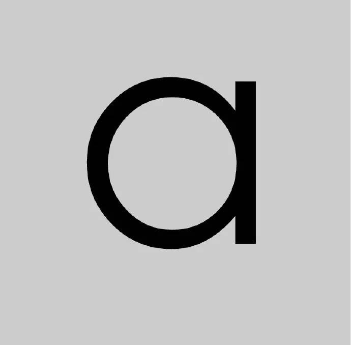
可以看到字母a垂直居中了,這個字母a就對應那個隱匿文字節點
七.FFC佈局背景關係下的水平垂直居中
父元素、子元素都定義flex:
DEMO連結:http://codepen.io/Dudy/pen/PqaXOZ?editors=110
程式碼:
居中居中居中居中居中居中居中
居中居中居中居中居中居中居中
居中居中居中居中居中居中居中
居中居中居中居中居中居中居中
居中居中居中居中居中居中居中
html,body{
width: 100%;
height: 100%;
}
.wrap{
display: flex;
align-items: center;
justify-content: center;
width: 100%;
height: 100%;
background-color: #ccc;
.ele{
background-color: #333;
}
}
只有父元素定義flex,子元素定義margin:auto:
DEMO連結:http://codepen.io/Dudy/pen/zGLzRN?editors=110
程式碼:
居中居中居中居中居中居中居中
居中居中居中居中居中居中居中
居中居中居中居中居中居中居中
居中居中居中居中居中居中居中
居中居中居中居中居中居中居中
html,body{
width: 100%;
height: 100%;
}
.wrap{
display: flex;
width: 100%;
height: 100%;
background-color: #ccc;
.ele{
margin:auto;
background-color: #333;
}
}
margin:auto在這裡垂直方向也生效了
flexbox是個很強大的佈局模組,也就三個屬性就搞定居中了,而且不論父容器還是居中元素都可以不定寬高。參考連結:圖解CSS3 Flexbox屬性
八.table佈局背景關係下的水平垂直居中
DEMO連結:http://codepen.io/Dudy/pen/EjRGRO?editors=110
程式碼:
居中居中居中居中居中居中居中居中
居中居中居中居中居中居中居中居中
居中居中居中居中居中居中居中居中居中居中
.wrap{
width: 100%;
height: 300px;
display: table;
background-color: #ccc;
}
.ele{
text-align:center;
vertical-align: middle;
display:table-cell;
}
.ele-inner{
display: inline-block;
background-color: #333;
}
原理就是把div模擬成表格(換成真正的表格標簽也是可以的),然後給那幾個屬性就成了,這個沒什麼好講的,不懂的去翻翻手冊就明白了,然後@於江水寫的一篇table那些事還不錯
九.CSS grid佈局背景關係下的水平垂直居中
CSS3 grid layout是IE搞出來的一個佈局模組,目前貌似還只有IE0和IE11支援,我沒有研究過其居中的方法,有興趣的可以看看大漠老師的介紹文章
十.其它未知歸屬的水平垂直居中方法
使用button標簽
DEMO連結:http://codepen.io/Dudy/pen/aOKPgr?editors=110
程式碼:
居中居中居中居中居中居中
居中居中居中居中居中居中
居中居中居中居中居中居中
居中居中居中居中居中居中
button{
width: 100%;
height: 400px;
background-color: #cccccc;
border-width:0;
&:focus{
outline:none;
}
div{
display: inline-block;
font-size: 18px;
background-color: #333;
color: #fff;
}
}
這種方法屬於奇淫技巧,利用button標簽天生外掛的這一技能對其裡面的元素進行居中。
(本文完)